R语言实战:中级绘图
目录
本文内容来自《R 语言实战》(R in Action, 2nd),有部分修改
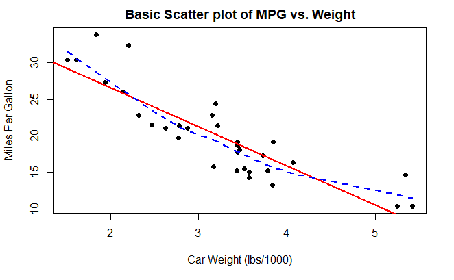
散点图
plot(
  mtcars$wt, mtcars$mpg,
  main="Basic Scatter plot of MPG vs. Weight",
  xlab="Car Weight (lbs/1000)",
  ylab="Miles Per Gallon",
  pch=19
)

abline(
  lm(mpg~wt, data=mtcars),
  col="red",
  lwd=2,
  lty=1
)

lines(
  lowess(mtcars$wt, mtcars$mpg),
  col="blue",
  lwd=2,
  lty=2
)
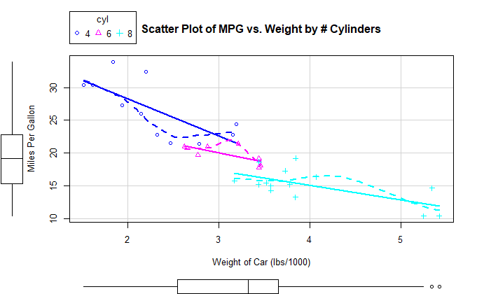
car 包的 scatterplot() 函数
library(car)
按条件绘图
scatterplot(
  mpg ~ wt | cyl,
  data=mtcars,
  lwd=2,
  smooth=list(span=0.75),
  main="Scatter Plot of MPG vs. Weight by # Cylinders",
  xlab="Weight of Car (lbs/1000)",
  ylab="Miles Per Gallon",
  legend=TRUE,
  boxplots="xy"
)
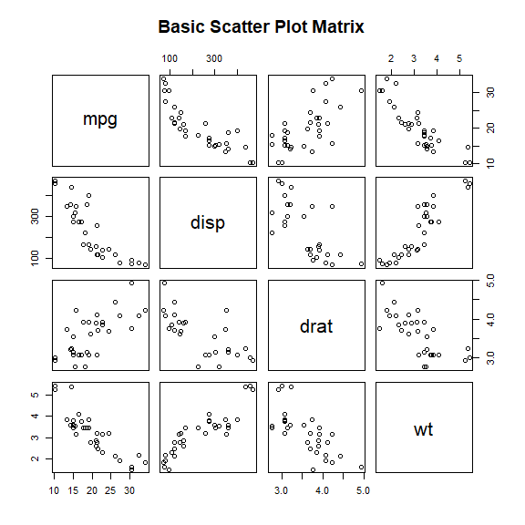
散点图矩阵
pairs() 函数绘制散点图矩阵
pairs(
  ~ mpg + disp + drat + wt,
  data=mtcars,
  main="Basic Scatter Plot Matrix"
)
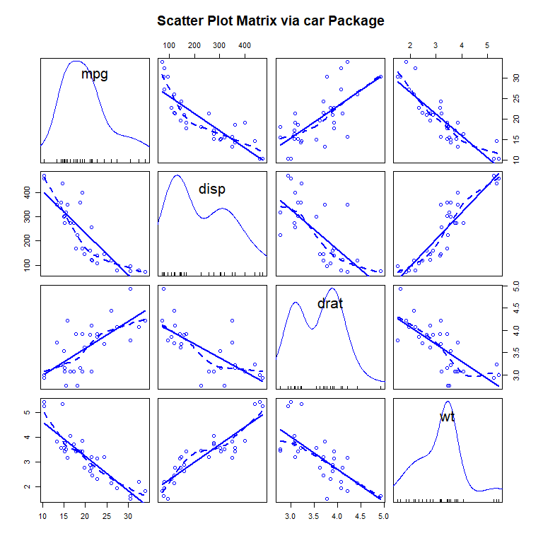
car 包的 scatterplotMatrix() 函数
scatterplotMatrix(
  ~ mpg + disp + drat + wt,
  data=mtcars,
  smooth=list(
    smoother=loessLine,
    lty.smooth=2,
    spread=FALSE
  ),
  main="Scatter Plot Matrix via car Package"
)
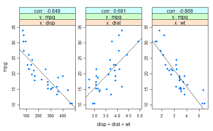
HH 包的 xysplom() 函数
library(HH)
xysplom(
  mpg ~ disp + drat + wt,
  data=mtcars,
  corr=TRUE
)
高密度散点图
生成重叠数据集
set.seed(1234)
n <- 10000
c1 <- matrix(
  rnorm(n, mean=0, sd=.5),
  ncol=2
)
c2 <- matrix(
  rnorm(n, mean=3, sd=2),
  ncol=2
)
my_data <- rbind(c1, c2)
my_data <- as.data.frame(my_data)
names(my_data) <- c("x", "y")
head(my_data)
           x          y
1 -0.6035329 -0.4125721
2  0.1387146  0.1735841
3  0.5422206 -0.4600465
4 -1.1728489 -0.1436682
5  0.2145623 -0.2755651
6  0.2530279  0.4243228
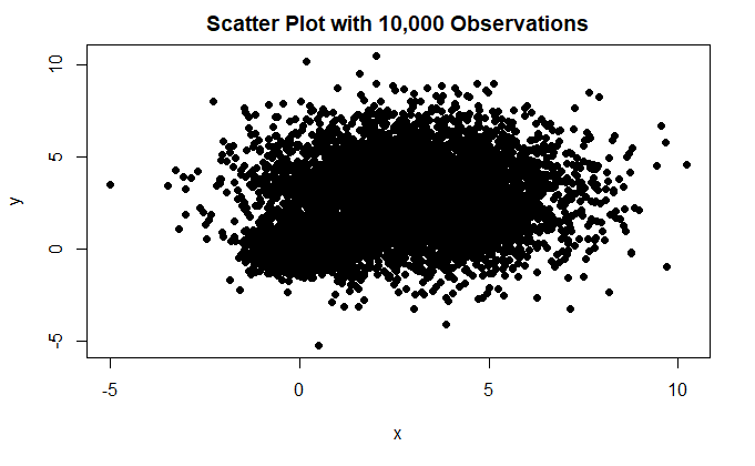
标准散点图中的点会堆叠在一起
with(
  my_data,
  plot(
    x, y,
    pch=19,
    main="Scatter Plot with 10,000 Observations"
  )
)
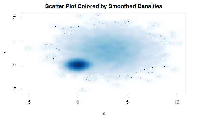
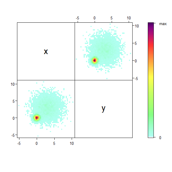
smoothScatter() 函数利用核密度估计生成用颜色密度表示点分布的散点图
with(
  my_data,
  smoothScatter(
    x, y,
    main="Scatter Plot Colored by Smoothed Densities"
  )
)
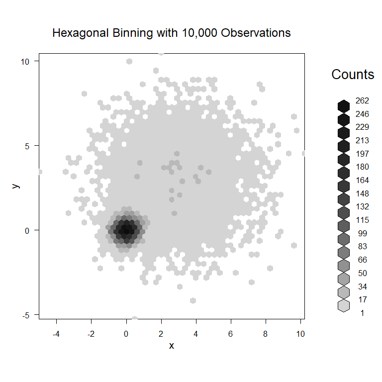
hexbin 包的 hexbin() 函数生成封箱图
library(hexbin)
with(
  my_data,
  {
    bin <- hexbin(
      x, y,
      xbins=50
    )
    plot(
      bin,
      main="Hexagonal Binning with 10,000 Observations",
    )
  }
)
IDPmisc 包的 ipairs() 函数
library(IDPmisc)
ipairs(my_data, pixs=1)
三维散点图
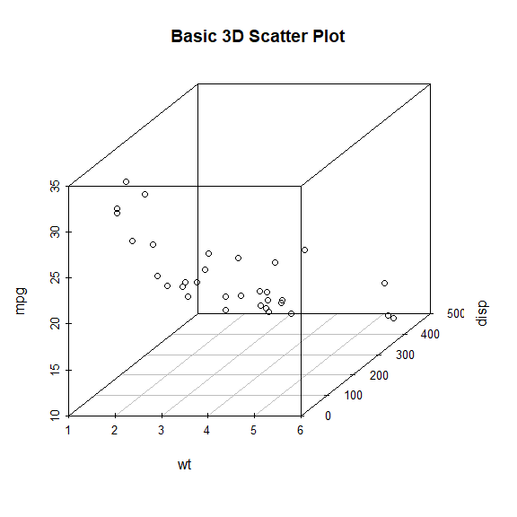
scatterplot3d 包中的 scatterplot3d() 函数
library(scatterplot3d)
attach(mtcars)
scatterplot3d(
  wt, disp, mpg,
  main="Basic 3D Scatter Plot"
)
detach(mtcars)
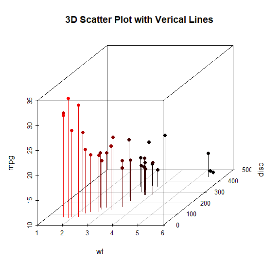
with(
  mtcars,
  scatterplot3d(
    wt, disp, mpg,
    pch=16,
    highlight.3d=TRUE,
    type="h",
    main="3D Scatter Plot with Verical Lines"
  )
)
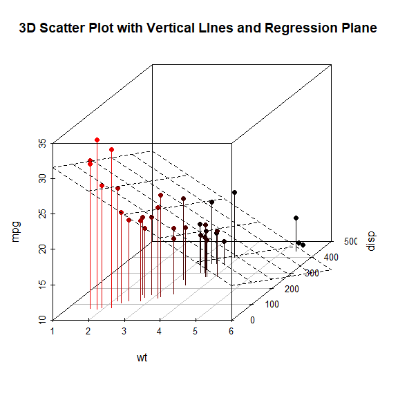
添加回归面
with(
  mtcars,
  {
    s3d <- scatterplot3d(
      wt, disp, mpg,
      pch=16,
      highlight.3d=TRUE,
      type="h",
      main="3D Scatter Plot with Vertical LInes and Regression Plane"
    )
    fit <- lm(mpg ~ wt + disp)
    s3d$plane3d(fit)
  }
)
旋转三维散点图
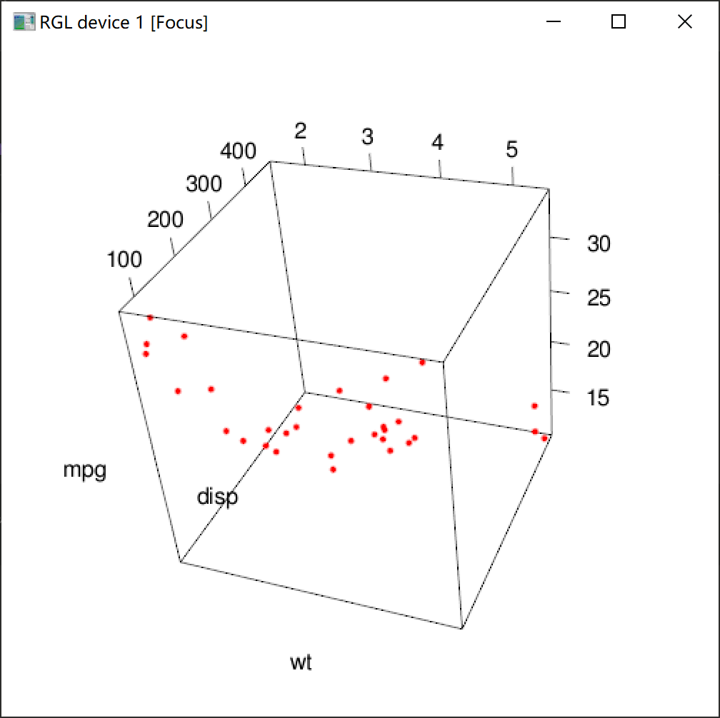
rgl 包中的 plot3d() 函数
library(rgl)
with(
  mtcars,
  plot3d(
    wt, disp, mpg,
    col="red",
    size=5
  )
)
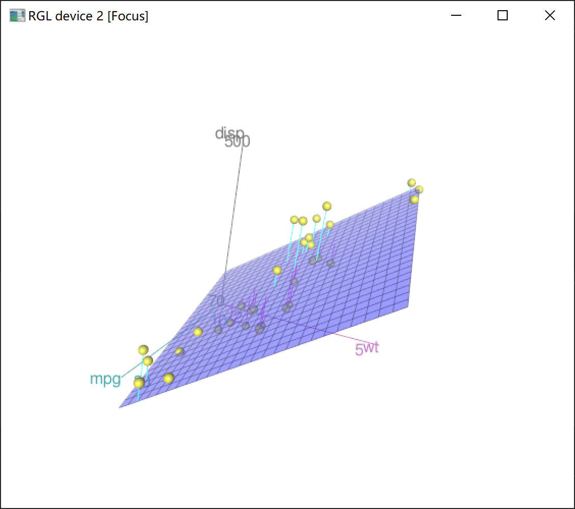
car 包中的 scatter3d() 函数
with(
  mtcars,
  scatter3d(
    wt, disp, mpg
  )
)
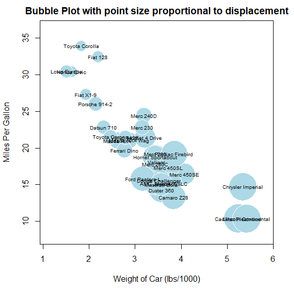
气泡图
bubble plot
symbols() 函数
使用面积表示 disp 变量,需要计算气泡半径
with(
  mtcars,
  {
    r <- sqrt(disp/pi)
    symbols(
      wt, mpg,
      circle=r,
      inches=0.30,
      fg="white",
      bg="lightblue",
      main="Bubble Plot with point size proportional to displacement",
      ylab="Miles Per Gallon",
      xlab="Weight of Car (lbs/1000)"
    )
    text(
      wt, mpg,
      rownames(mtcars),
      cex=0.6
    )
  }
)
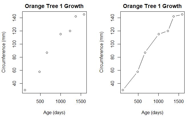
折线图
tail(Orange)
Grouped Data: circumference ~ age | Tree
   Tree  age circumference
30    5  484            49
31    5  664            81
32    5 1004           125
33    5 1231           142
34    5 1372           174
35    5 1582           177
t1 <- subset(
  Orange,
  Tree==1
)
tail(t1)
Grouped Data: circumference ~ age | Tree
  Tree  age circumference
2    1  484            58
3    1  664            87
4    1 1004           115
5    1 1231           120
6    1 1372           142
7    1 1582           145
opar <- par(no.readonly=TRUE)
par(mfrow=c(1, 2))

plot(
  t1$age, t1$circumference,
  xlab="Age (days)",
  ylab="Circumference (mm)",
  main="Orange Tree 1 Growth"
)

plot(
  t1$age, t1$circumference,
  xlab="Age (days)",
  ylab="Circumference (mm)",
  main="Orange Tree 1 Growth",
  type="b"
)

par(opar)
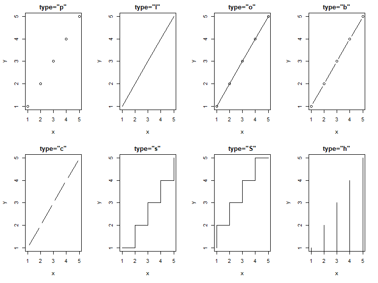
type 指定折线图类型
x <- y <- 1:5
opar <- par(no.readonly=TRUE)
par(mfrow=c(2, 4))

type_list <- c(
  "p",
  "l",
  "o",
  "b",
  "c",
  "s",
  "S",
  "h"
)

for (t in type_list) {
  plot(
    x, y,
    type=t,
    xlab="x",
    ylab="y",
    main=paste("type=\"", t, "\"", sep="")
  )
}

par(opar)
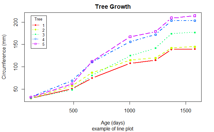
绘制更复杂的折线图
Orange$Tree <- as.numeric(Orange$Tree)
ntrees <- max(Orange$Tree)
xrange <- range(Orange$age)
yrange <- range(Orange$circumference)
colors <- rainbow(ntrees)
line_type <- c(1:ntrees)
plot_char <- seq(18, 18+ntrees, 1)
plot(
  xrange, yrange,
  type="n",
  xlab="Age (days)",
  ylab="Circumference (mm)"
)

for (i in 1:ntrees) {
  tree <- subset(Orange, Tree==i)
  lines(
    tree$age, tree$circumference,
    type="b",
    lwd=2,
    lty=line_type[i],
    col=colors[i],
    pch=plot_char[i]
  )
}

title(
  "Tree Growth",
  "example of line plot"
)

legend(
  xrange[1], yrange[2],
  1:ntrees,
  cex=0.8,
  col=colors,
  pch=plot_char,
  lty=line_type,
  title="Tree"
)
相关图
cor() 求相关矩阵
options(digits=2)
cor(mtcars)
       mpg   cyl  disp    hp   drat    wt   qsec    vs     am  gear   carb
mpg   1.00 -0.85 -0.85 -0.78  0.681 -0.87  0.419  0.66  0.600  0.48 -0.551
cyl  -0.85  1.00  0.90  0.83 -0.700  0.78 -0.591 -0.81 -0.523 -0.49  0.527
disp -0.85  0.90  1.00  0.79 -0.710  0.89 -0.434 -0.71 -0.591 -0.56  0.395
hp   -0.78  0.83  0.79  1.00 -0.449  0.66 -0.708 -0.72 -0.243 -0.13  0.750
drat  0.68 -0.70 -0.71 -0.45  1.000 -0.71  0.091  0.44  0.713  0.70 -0.091
wt   -0.87  0.78  0.89  0.66 -0.712  1.00 -0.175 -0.55 -0.692 -0.58  0.428
qsec  0.42 -0.59 -0.43 -0.71  0.091 -0.17  1.000  0.74 -0.230 -0.21 -0.656
vs    0.66 -0.81 -0.71 -0.72  0.440 -0.55  0.745  1.00  0.168  0.21 -0.570
am    0.60 -0.52 -0.59 -0.24  0.713 -0.69 -0.230  0.17  1.000  0.79  0.058
gear  0.48 -0.49 -0.56 -0.13  0.700 -0.58 -0.213  0.21  0.794  1.00  0.274
carb -0.55  0.53  0.39  0.75 -0.091  0.43 -0.656 -0.57  0.058  0.27  1.000
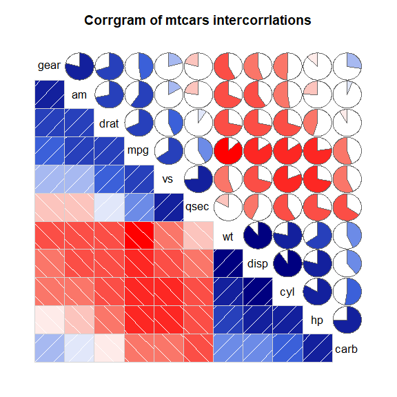
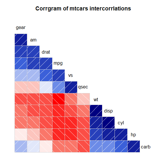
corrgram 包的 corrgram() 函数
library(corrgram)
corrgram(
  mtcars,
  order=TRUE,
  lower.panel=panel.shade,
  upper.panel=panel.pie,
  text.panel=panel.txt,
  main="Corrgram of mtcars intercorrlations"
)
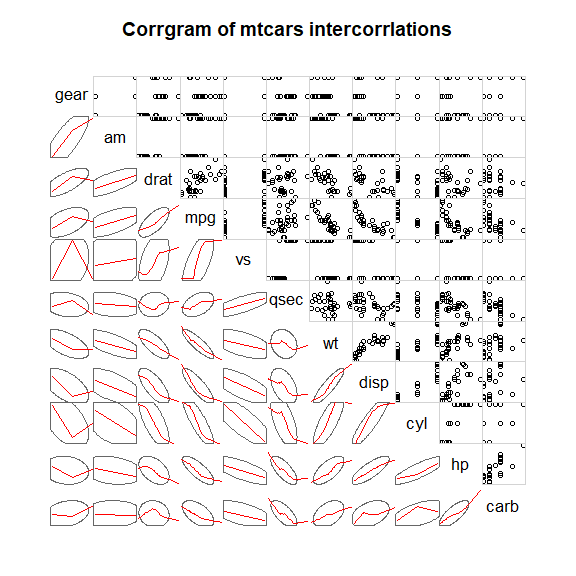
可以设置上下三角和对角线显示的内容
corrgram(
  mtcars,
  order=TRUE,
  lower.panel=panel.ellipse,
  upper.panel=panel.pts,
  text.panel=panel.txt,
  main="Corrgram of mtcars intercorrlations"
)
可以隐藏某部分
corrgram(
  mtcars,
  order=TRUE,
  lower.panel=panel.shade,
  upper.panel=NULL,
  text.panel=panel.txt,
  main="Corrgram of mtcars intercorrlations"
)
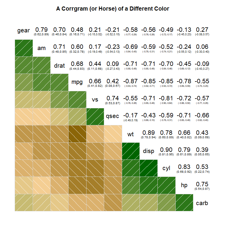
colorRampPallette() 函数设置颜色
cols <- colorRampPalette(
  c(
    "darkgoldenrod4",
    "burlywood1",
    "darkkhaki",
    "darkgreen"
  )
)
corrgram(
  mtcars,
  order=TRUE,
  col.regions=cols,
  lower.panel=panel.shade,
  upper.panel=panel.conf,
  text.panel=panel.txt,
  main="A Corrgram (or Horse) of a Different Color"
)
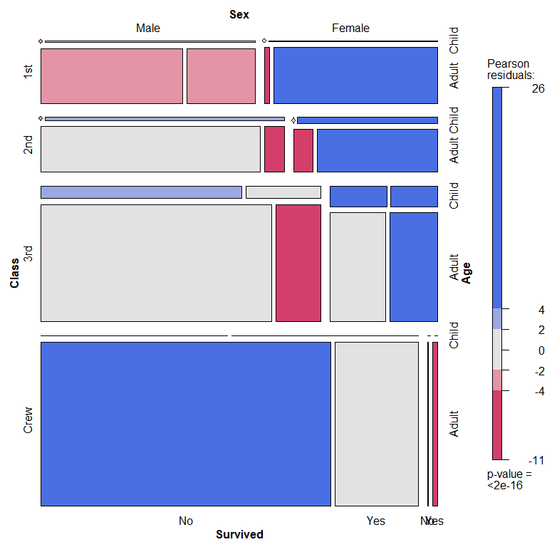
马赛克图
mosaic plot
ftable(Titanic)
                   Survived  No Yes
Class Sex    Age
1st   Male   Child            0   5
             Adult          118  57
      Female Child            0   1
             Adult            4 140
2nd   Male   Child            0  11
             Adult          154  14
      Female Child            0  13
             Adult           13  80
3rd   Male   Child           35  13
             Adult          387  75
      Female Child           17  14
             Adult           89  76
Crew  Male   Child            0   0
             Adult          670 192
      Female Child            0   0
             Adult            3  20
vcd 包中的 mosaic() 函数
library(vcd)
mosaic(
  Titanic,
  shade=TRUE,
  legend=TRUE
)
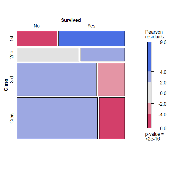
mosaic(
  ~ Class + Survived,
  data=Titanic,
  shade=TRUE,
  legend=TRUE
)
参考
https://github.com/perillaroc/r-in-action-study
R 语言实战