R语言实战:基本图形
目录
本文内容来自《R 语言实战》(R in Action, 2nd),有部分修改
条形图
vcd 包的 Arthritis 数据集
library(vcd)
head(Arthritis)
  ID Treatment  Sex Age Improved
1 57   Treated Male  27     Some
2 46   Treated Male  29     None
3 77   Treated Male  30     None
4 17   Treated Male  32   Marked
5 36   Treated Male  46   Marked
6 23   Treated Male  58   Marked
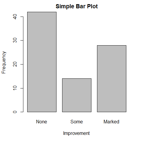
简单条形图
barplot() 函数
counts <- table(Arthritis$Improved)
counts
  None   Some Marked
    42     14     28
barplot(
  counts,
  main="Simple Bar Plot",
  xlab="Improvement",
  ylab="Frequency"
)
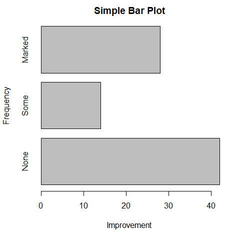
barplot(
  counts,
  main="Simple Bar Plot",
  xlab="Improvement",
  ylab="Frequency",
  horiz=TRUE
)

因为 Arthritis$Improved 是因子变量,可以直接使用 plot() 绘制条形图,无需使用 table() 函数
plot(
  Arthritis$Improved,
  main="Simple Bar Plot",
  xlab="Improvement",
  ylab="Frequency",
  horiz=TRUE
)
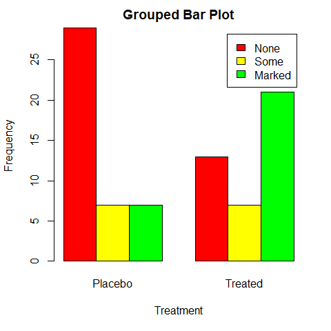
堆砌条形图和分组条形图
生成列联表
counts <- table(
  Arthritis$Improved,
  Arthritis$Treatment
)
counts
         Placebo Treated
  None        29      13
  Some         7       7
  Marked       7      21
barplot(
  counts,
  main="Stacked Bar Plot",
  xlab="Treatment",
  ylab="Frequency",
  col=c("red", "yellow", "green"),
  legend=rownames(counts)
)
barplot(
  counts,
  main="Grouped Bar Plot",
  xlab="Treatment",
  ylab="Frequency",
  col=c("red", "yellow", "green"),
  legend=rownames(counts),
  beside=TRUE
)
均值条形图
head(state.region)
[1] South West  West  South West  West
Levels: Northeast South North Central West
states <- data.frame(
  state.region,
  state.x77
)
head(states)
           state.region Population Income Illiteracy Life.Exp Murder HS.Grad Frost   Area
Alabama           South       3615   3624        2.1    69.05   15.1    41.3    20  50708
Alaska             West        365   6315        1.5    69.31   11.3    66.7   152 566432
Arizona            West       2212   4530        1.8    70.55    7.8    58.1    15 113417
Arkansas          South       2110   3378        1.9    70.66   10.1    39.9    65  51945
California         West      21198   5114        1.1    71.71   10.3    62.6    20 156361
Colorado           West       2541   4884        0.7    72.06    6.8    63.9   166 103766
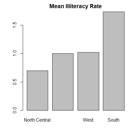
means <- aggregate(
  states$Illiteracy,
  by=list(state.region),
  FUN=mean
)
means
        Group.1        x
1     Northeast 1.000000
2         South 1.737500
3 North Central 0.700000
4          West 1.023077
means <- means[order(means$x),]
means
        Group.1        x
3 North Central 0.700000
1     Northeast 1.000000
4          West 1.023077
2         South 1.737500
names.arg 设置标签名称
barplot(
  means$x,
  names.arg=means$Group.1
)
title("Mean Illiteracy Rate")
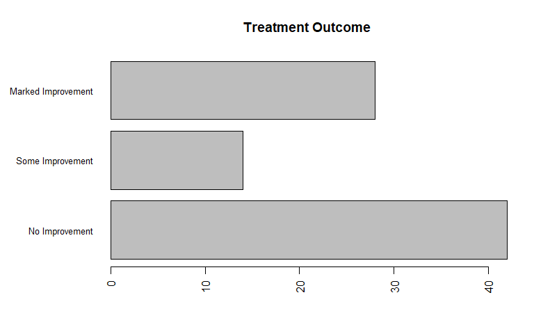
条形图的微调
par(mar=c(5, 8, 4, 2))
par(las=2)
counts <- table(Arthritis$Improved)
barplot(
  counts,
  main="Treatment Outcome",
  horiz=TRUE,
  cex.names=0.8,
  names.arg=c(
    "No Improvement",
    "Some Improvement",
    "Marked Improvement"
  )
)
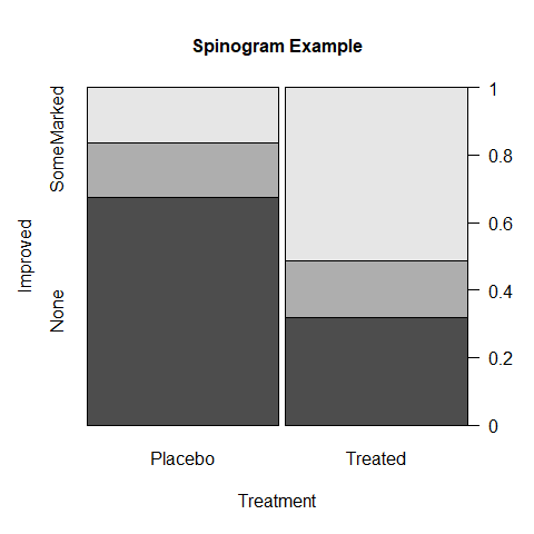
棘状图
spinogram
attach(Arthritis)
counts <- table(Treatment, Improved)
spine(
  counts,
  main="Spinogram Example"
)
detach(Arthritis)
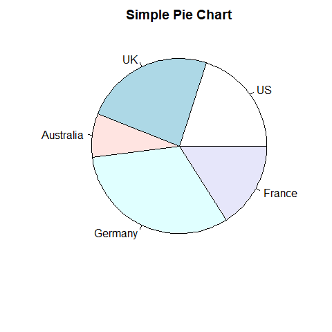
饼图
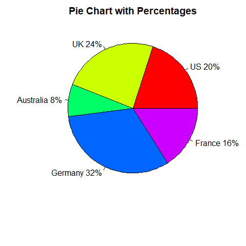
slices <- c(10, 12, 4, 16, 8)
lbls <- c("US", "UK", "Australia", "Germany", "France")
pie(
  slices,
  labels=lbls,
  main="Simple Pie Chart"
)
pct <- round(slices/sum(slices)*100)
lbls2 <- paste(lbls, " ", pct, "%", sep="")
pie(
  slices,
  labels=lbls2,
  col=rainbow(length(lbls2)),
  main="Pie Chart with Percentages"
)
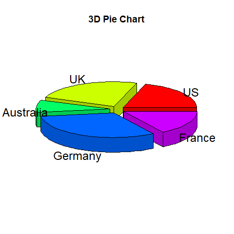
library(plotrix)
pie3D(
  slices,
  labels=lbls,
  explode=0.1,
  main="3D Pie Chart"
)
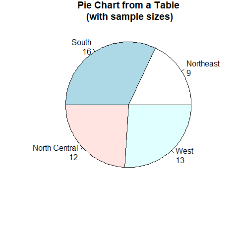
my_table <- table(state.region)
lbls3 <- paste(names(my_table), "\n", my_table, sep="")
pie(
  my_table,
  labels=lbls3,
  main="Pie Chart from a Table\n (with sample sizes)"
)
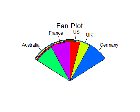
扇形图 fan plot
fan.plot(
  slices,
  labels=lbls,
  main="Fan Plot"
)
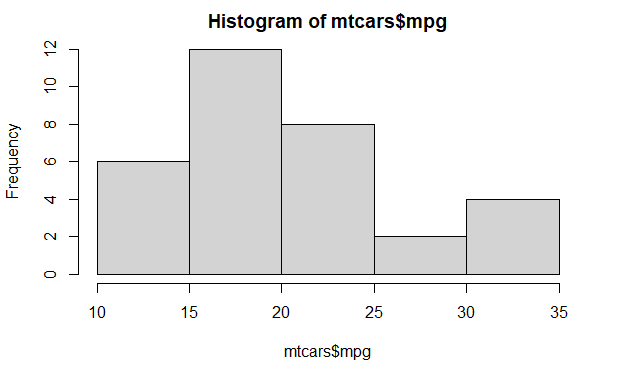
直方图
head(mtcars)
                   mpg cyl disp  hp drat    wt  qsec vs am gear carb cyl.f     am.f
Mazda RX4         21.0   6  160 110 3.90 2.620 16.46  0  1    4    4     6 standard
Mazda RX4 Wag     21.0   6  160 110 3.90 2.875 17.02  0  1    4    4     6 standard
Datsun 710        22.8   4  108  93 3.85 2.320 18.61  1  1    4    1     4 standard
Hornet 4 Drive    21.4   6  258 110 3.08 3.215 19.44  1  0    3    1     6     auto
Hornet Sportabout 18.7   8  360 175 3.15 3.440 17.02  0  0    3    2     8     auto
Valiant           18.1   6  225 105 2.76 3.460 20.22  1  0    3    1     6     auto
hist(mtcars$mpg)
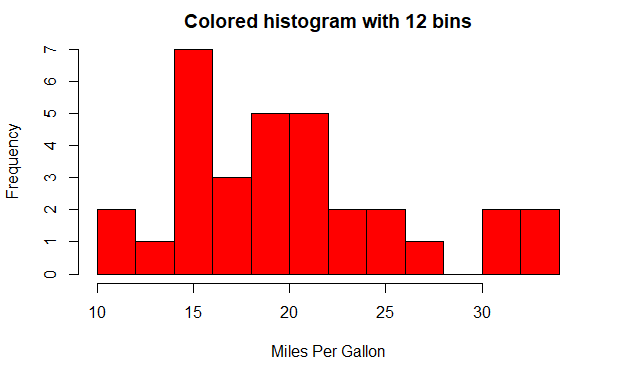
breaks 指定分组数
hist(
  mtcars$mpg,
  breaks=12,
  col="red",
  xlab="Miles Per Gallon",
  main="Colored histogram with 12 bins"
)
rug() 绘制轴须图 (rug plot)
density() 生成密度曲线
hist(
  mtcars$mpg,
  freq=FALSE,
  breaks=12,
  col="red",
  xlab="Miles Per Gallon",
  main="Histogram, rug plot, density curve"
)
rug(jitter(mtcars$mpg))
lines(
  density(mtcars$mpg),
  col="blue",
  lwd=2
)

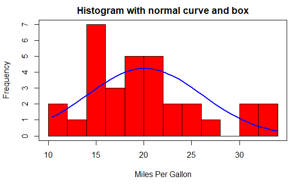
叠加正态曲线,box() 绘制框图
x <- mtcars$mpg

h <- hist(
  x,
  breaks=12,
  col="red",
  xlab="Miles Per Gallon",
  main="Histogram with normal curve and box"
)

xfit <- seq(
  min(x), max(x), length=40
)
yfit <- dnorm(
  xfit,
  mean=mean(x),
  sd=sd(x)
)
yfit <- yfit * diff(h$mids[1:2]) * length(x)

lines(
  xfit,
  yfit,
  col="blue",
  lwd=2
)

box()
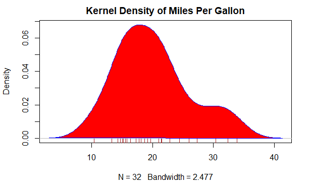
核密度图
d <- density(mtcars$mpg)
d
Call:
	density.default(x = mtcars$mpg)

Data: mtcars$mpg (32 obs.);	Bandwidth 'bw' = 2.477

       x               y
 Min.   : 2.97   Min.   :6.481e-05
 1st Qu.:12.56   1st Qu.:5.461e-03
 Median :22.15   Median :1.926e-02
 Mean   :22.15   Mean   :2.604e-02
 3rd Qu.:31.74   3rd Qu.:4.530e-02
 Max.   :41.33   Max.   :6.795e-02
plot(d)
plot(
  d,
  main="Kernel Density of Miles Per Gallon"
)
polygon(
  d,
  col="red",
  border="blue"
)
rug(mtcars$mpg, col="brown")
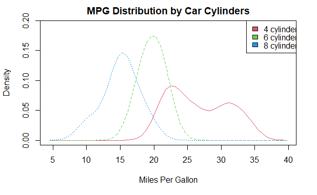
sm 包 sm.density.compare() 函数比较组间差异
library(sm)
attach(mtcars)

# 创建分组因子
cyl.f <- factor(
  cyl,
  levels=c(4, 6, 8),
  labels=c(
    "4 cylinder",
    "6 cylinder",
    "8 cylinder"
  )
)

# 绘制密度图
sm.density.compare(
  mpg,
  cyl,
  xlab="Miles Per Gallon"
)
title(main="MPG Distribution by Car Cylinders")

# 添加图例
colfill <- c(2:(1+length(levels(cyl.f))))
legend("topright", levels(cyl.f), fill=colfill)

detach(mtcars)
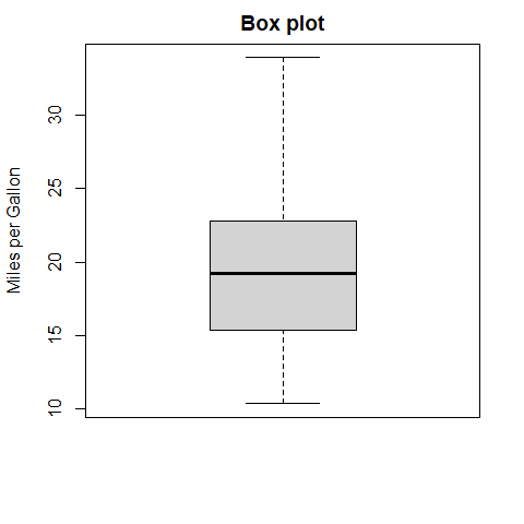
箱线图
boxplot(
  mtcars$mpg,
  main="Box plot",
  ylab="Miles per Gallon"
)
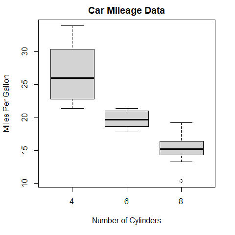
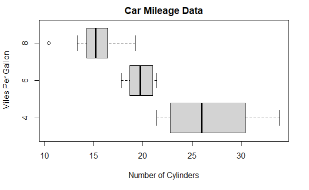
使用并列箱线图进行跨组比较
boxplot(
  mpg ~ cyl,
  data=mtcars,
  main="Car Mileage Data",
  xlab="Number of Cylinders",
  ylab="Miles Per Gallon"
)
boxplot(
  mpg ~ cyl,
  data=mtcars,
  main="Car Mileage Data",
  xlab="Number of Cylinders",
  ylab="Miles Per Gallon",
  horizontal=TRUE
)
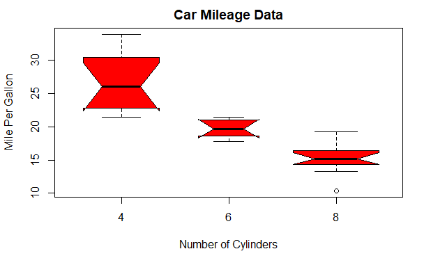
varwidth=TRUE 宽度与样本大小的平方根成正比
notch=TRUE 含凹槽的箱线图
boxplot(
  mpg ~ cyl,
  data=mtcars,
  notch=TRUE,
  varwidth=TRUE,
  col="red",
  main="Car Mileage Data",
  xlab="Number of Cylinders",
  ylab="Mile Per Gallon"
)
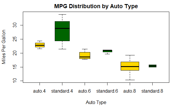
多因子组合
mtcars$cyl.f <- factor(
  mtcars$cyl,
  levels=c(4, 6, 8),
  labels=c("4", "6", "8")
)

mtcars$am.f <- factor(
  mtcars$am,
  levels=c(0, 1),
  labels=c("auto", "standard")
)

boxplot(
  mpg ~ am.f * cyl.f,
  data=mtcars,
  varwidth=TRUE,
  col=c("gold", "darkgreen"),
  main="MPG Distribution by Auto Type",
  xlab="Auto Type",
  ylab="Miles Per Gallon"
)
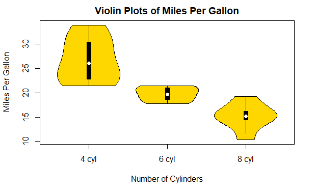
小提琴图
violin plot
白点是中位数,黑色盒形的范围是上下四分位点,细黑线表示须,外部形状是核密度估计
vioplot 包的 vioplot() 函数
library(vioplot)
x1 <- mtcars$mpg[mtcars$cyl == 4]
x2 <- mtcars$mpg[mtcars$cyl == 6]
x3 <- mtcars$mpg[mtcars$cyl == 8]
vioplot(
  x1,
  x2,
  x3,
  names=c("4 cyl", "6 cyl", "8 cyl"),
  col="gold"
)

title(
  "Violin Plots of Miles Per Gallon",
  ylab="Miles Per Gallon",
  xlab="Number of Cylinders"
)
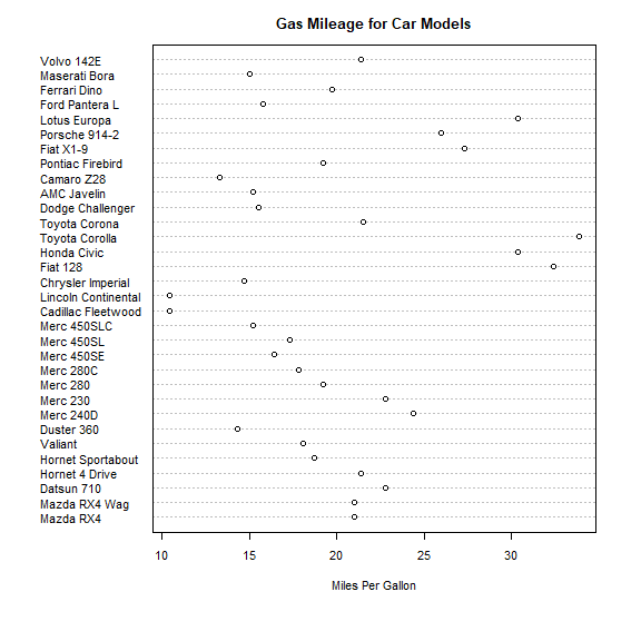
点图
dotchart()
dotchart(
  mtcars$mpg,
  labels=row.names(mtcars),
  cex=.7,
  main="Gas Mileage for Car Models",
  xlab="Miles Per Gallon"
)
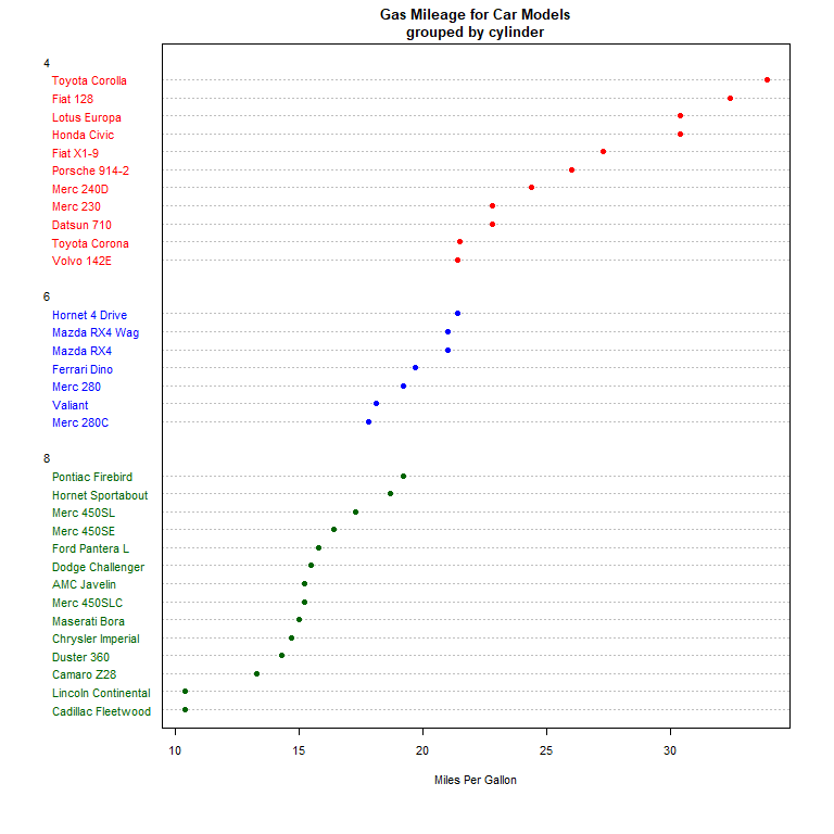
group 确定分组,gcolor 指定分组颜色
x <- mtcars[order(mtcars$mpg),]
x$cyl <- factor(x$cyl)

x$color[x$cyl == 4] <- "red"
x$color[x$cyl == 6] <- "blue"
x$color[x$cyl == 8] <- "darkgreen"

dotchart(
  x$mpg,
  labels=row.names(x),
  cex=.7,
  groups=x$cyl,
  gcolor="black",
  color=x$color,
  pch=19,
  main="Gas Mileage for Car Models\ngrouped by cylinder",
  xlab="Miles Per Gallon"
)
参考
R 语言实战
《图形初阶》
《基本数据管理》
《高级数据管理》