R语言实战:使用ggplot2进行高级绘图
目录
本文内容来自《R 语言实战》(R in Action, 2nd),有部分修改
介绍ggplot2包
library(ggplot2)
library(car)
library(gridExtra)
R 中的四种图形系统
基础图形系统
grid 图形系统
lattice 包
ggplot2 包
ggplot2 包介绍
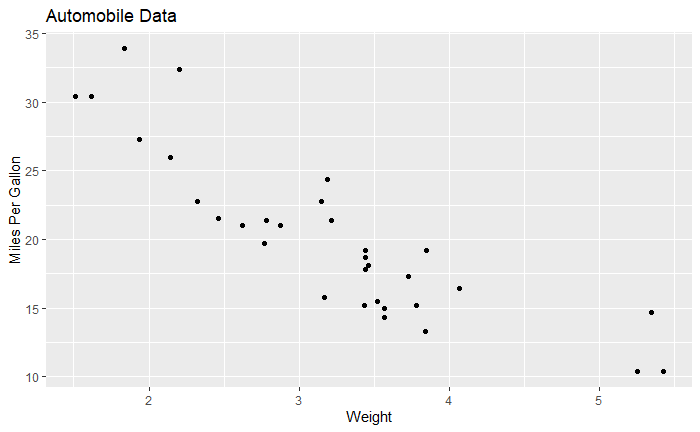
ggplot(data=mtcars, aes(x=wt, y=mpg)) +
  geom_point() +
  labs(
    title="Automobile Data",
    x="Weight",
    y="Miles Per Gallon"
  )
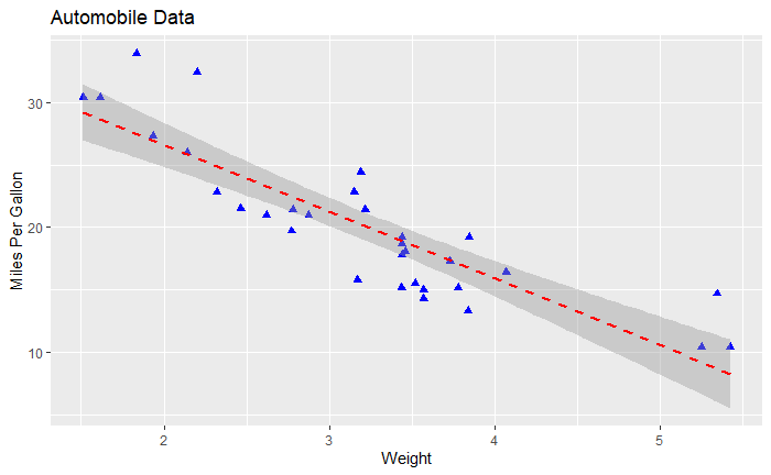
添加线性拟合
ggplot(data=mtcars, aes(x=wt, y=mpg)) +
  geom_point(pch=17, color="blue", size=2) +
  geom_smooth(method="lm", color="red", linetype=2) +
  labs(
    title="Automobile Data",
    x="Weight",
    y="Miles Per Gallon"
  )
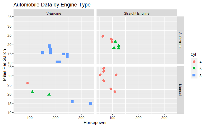
将变量转为因子
mtcars$am <- factor(
  mtcars$am,
  levels=c(0, 1),
  labels=c("Automatic", "Manual")
)
mtcars$vs <- factor(
  mtcars$vs,
  levels=c(0, 1),
  labels=c("V-Engine", "Straight Engline")
)
mtcars$cyl <- factor(mtcars$cyl)
分组和面
ggplot(data=mtcars, aes(x=hp, y=mpg, shape=cyl, color=cyl)) +
  geom_point(size=3) +
  facet_grid(am~vs) +
  labs(
    title="Automobile Data by Engine Type",
    x="Horsepower",
    y="Miles Per Gallon"
  )
用几何函数指定图的类型
常见的几何函数
| 函数 | 说明 |
|---|---|
geom_bar() | 条形图 |
geom_boxplot() | 箱线图 |
geom_density() | 密度图 |
geom_histogram() | 直方图 |
geom_hline() | 水平线 |
geom_jitter() | 抖动点 |
geom_line() | 线图 |
geom_point() | 散点图 |
geom_rug() | 地毯图 |
geom_smooth() | 拟合曲线 |
geom_text() | 文字注解 |
geom_violin() | 小提琴图 |
geom_vline() | 垂线 |
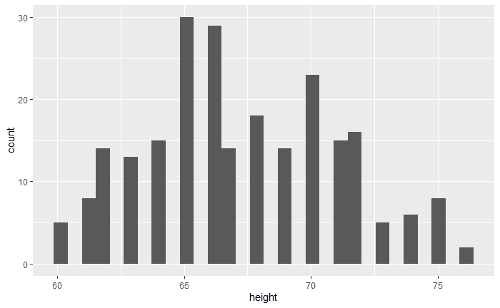
data(singer, package="lattice")
直方图
ggplot(singer, aes(x=height)) + geom_histogram()
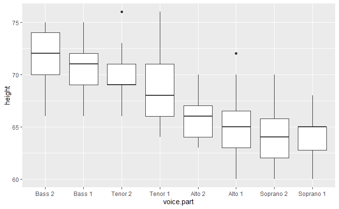
箱线图
ggplot(singer, aes(x=voice.part, y=height)) + geom_boxplot()
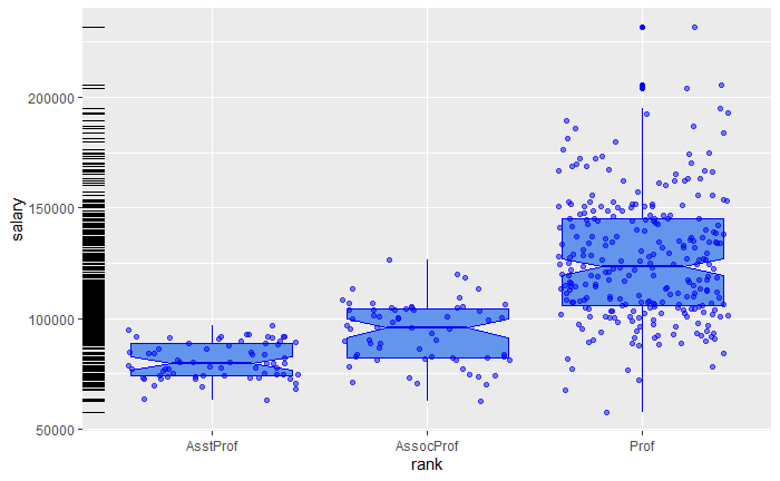
设置选项
data(Salaries, package="car")
ggplot(Salaries, aes(x=rank, y=salary)) +
  geom_boxplot(fill="cornflowerblue", color="blue", notch=TRUE) +
  geom_point(position="jitter", color="blue", alpha=.5) +
  geom_rug(sides="l", color="black")
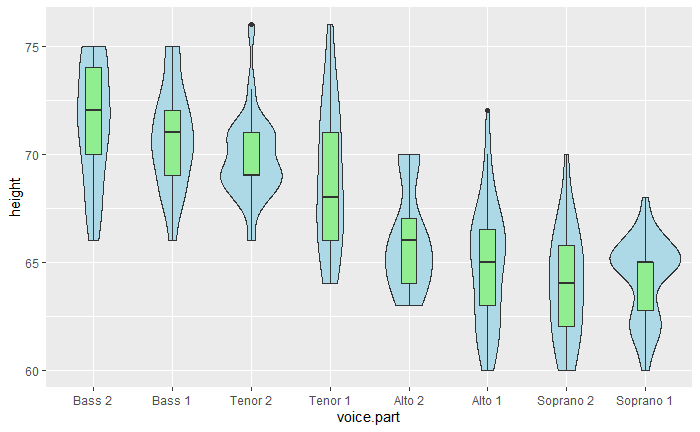
组合图形
ggplot(singer, aes(x=voice.part, y=height)) +
  geom_violin(fill="lightblue") +
  geom_boxplot(fill="lightgreen", width=.2)
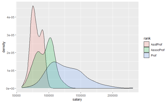
分组
带有视觉特征的分组变量
ggplot(Salaries, aes(x=salary, fill=rank)) +
  geom_density(alpha=.2)
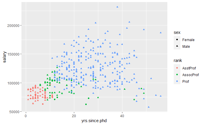
ggplot(Salaries, aes(x=yrs.since.phd, y=salary, color=rank, shape=sex)) +
  geom_point()
q1 <- ggplot(Salaries, aes(x=rank, fill=sex)) +
  geom_bar(position="stack") +
  labs(title='position="stack"') +
  theme(legend.position="bottom")
q2 <- ggplot(Salaries, aes(x=rank, fill=sex)) +
  geom_bar(position="dodge") +
  labs(title='position="dodge"') +
  theme(legend.position="bottom")
q3 <- ggplot(Salaries, aes(x=rank, fill=sex)) +
  geom_bar(position="fill") +
  labs(title='position="fill"', y="proportion") +
  theme(legend.position="bottom")
grid.arrange(q1, q2, q3, ncol=3)
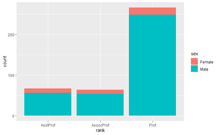
ggplot(Salaries, aes(x=rank, fill=sex)) + geom_bar()
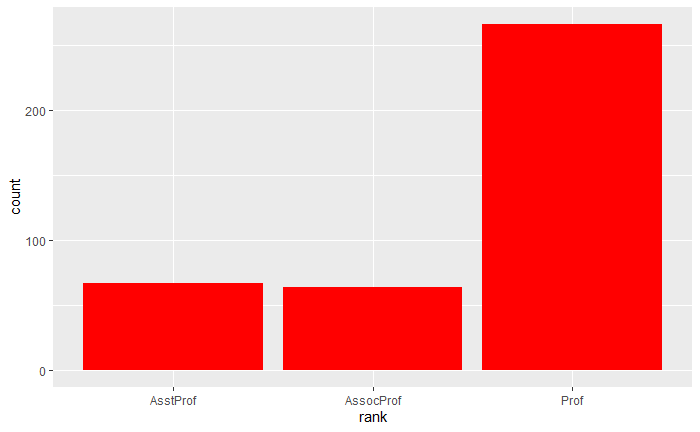
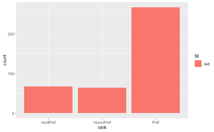
ggplot(Salaries, aes(x=rank)) + geom_bar(fill="red")
ggplot(Salaries, aes(x=rank, fill="red")) + geom_bar()
刻面
facet_wrap() 和 facet_grid() 函数
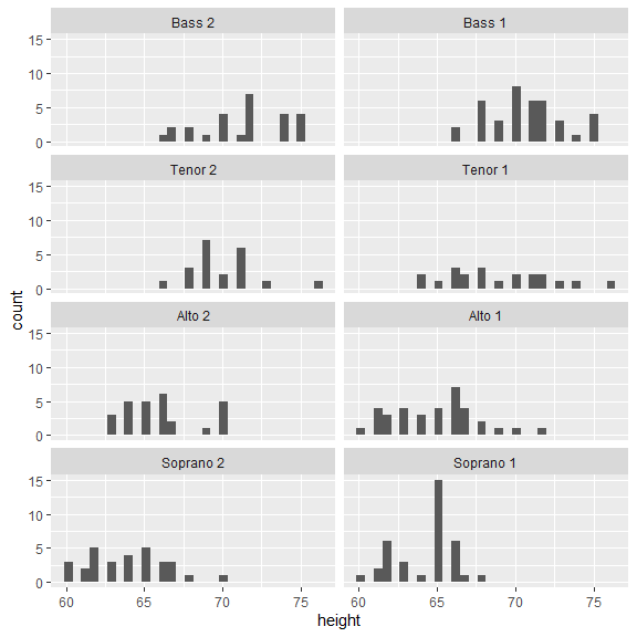
ggplot(data=singer, aes(x=height)) +
  geom_histogram() +
  facet_wrap(~voice.part, nrow=4)
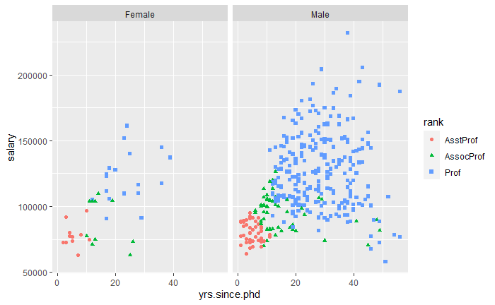
同时包含刻面和分组
ggplot(Salaries, aes(x=yrs.since.phd, y=salary, color=rank, shape=rank)) +
  geom_point() +
  facet_grid(.~sex)
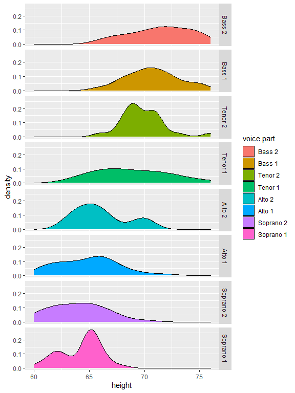
ggplot(data=singer, aes(x=height, fill=voice.part)) +
  geom_density() +
  facet_grid(voice.part~.)
添加光滑曲线
带有 95% 置信区间的非参数光滑曲线 (loess)
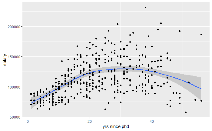
ggplot(data=Salaries, aes(x=yrs.since.phd, y=salary)) +
  geom_smooth() +
  geom_point()
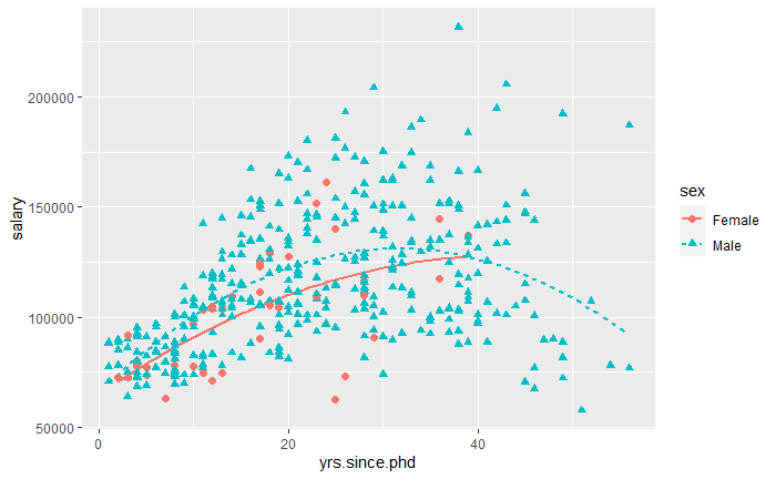
二次多项式回归
ggplot(data=Salaries, aes(
  x=yrs.since.phd, y=salary, linetype=sex, shape=sex, color=sex
)) +
  geom_smooth(
    method=lm,
    formula=y~poly(x, 2),
    se=FALSE,
    size=1
  ) +
  geom_point(size=2)
修改 ggplot2 图形的外观
坐标轴
控制坐标轴和刻度线外观的函数
scale_x_continuous() 和 scale_y_continuous()
scale_x_discrete() 和 scale_y_discrete()
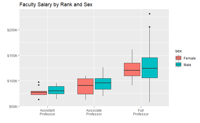
ggplot(data=Salaries, aes(x=rank, y=salary, fill=sex)) +
  geom_boxplot() +
  scale_x_discrete(
    breaks=c("AsstProf", "AssocProf", "Prof"),
    labels=c("Assistant\nProfessor",
             "Associate\nProfessor",
             "Full\nProfessor")
  ) +
  scale_y_continuous(
    breaks=c(50000, 100000, 150000, 200000),
    labels=c("$50K", "$100K", "$150K", "$200K")
  ) +
  labs(
    title="Faculty Salary by Rank and Sex",
    x="",
    y=""
  )
图例
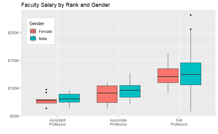
ggplot(data=Salaries, aes(x=rank, y=salary, fill=sex)) +
  geom_boxplot() +
  scale_x_discrete(
    breaks=c("AsstProf", "AssocProf", "Prof"),
    labels=c("Assistant\nProfessor",
             "Associate\nProfessor",
             "Full\nProfessor")
  ) +
  scale_y_continuous(
    breaks=c(50000, 100000, 150000, 200000),
    labels=c("$50K", "$100K", "$150K", "$200K")
  ) +
  labs(
    title="Faculty Salary by Rank and Gender",
    x="",
    y="",
    fill="Gender"
  ) +
  theme(legend.position=c(.1, .8))
标尺
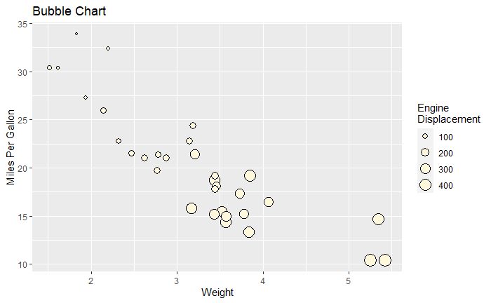
ggplot(mtcars, aes(x=wt, y=mpg, size=disp)) +
  geom_point(shape=21, color="black", fill="cornsilk") +
  labs(
    x="Weight",
    y="Miles Per Gallon",
    title="Bubble Chart",
    size="Engine\nDisplacement"
  )
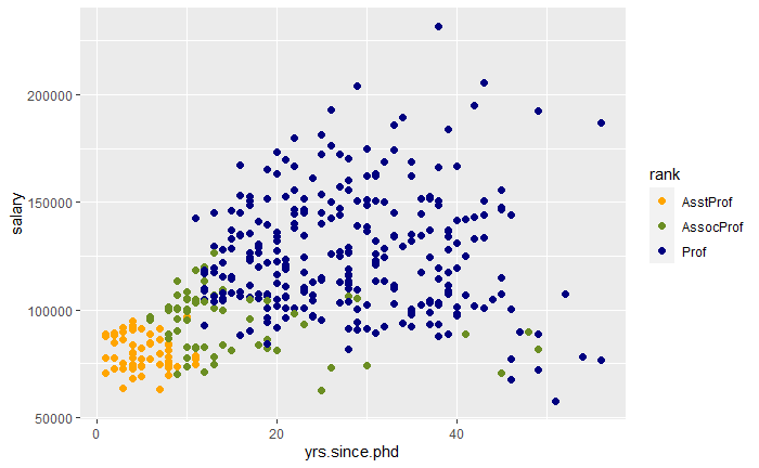
ggplot(data=Salaries, aes(x=yrs.since.phd, y=salary, color=rank)) +
  scale_color_manual(
    values=c("orange", "olivedrab", "navy")
  ) +
  geom_point(size=2)
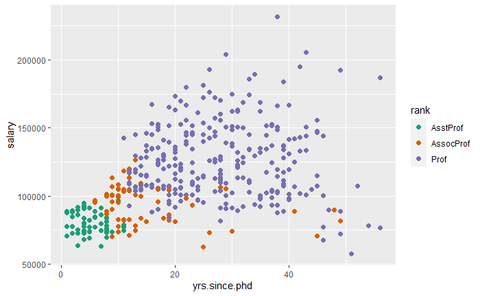
ggplot(data=Salaries, aes(x=yrs.since.phd, y=salary, color=rank)) +
  scale_color_brewer(palette="Dark2") +
  geom_point(size=2)
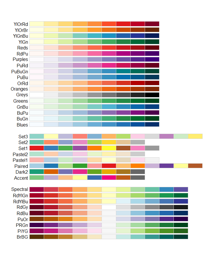
显示所有的 ColorBrewer 颜色集
library(RColorBrewer)
display.brewer.all()
主题
theme() 函数定制主题
mytheme <- theme(
  plot.title=element_text(
    face="bold.italic",
    size="14",
    color="brown"
  ),
  axis.title=element_text(
    face="bold.italic",
    size=10,
    color="brown"
  ),
  axis.text=element_text(
    face="bold",
    size=9,
    color="darkblue"
  ),
  panel.background=element_rect(
    fill="white",
    color="darkblue"
  ),
  panel.grid.major.y=element_line(
    color="grey",
    linetype=1
  ),
  panel.grid.minor.y=element_line(
    color="grey",
    linetype=2
  ),
  panel.grid.minor.x=element_blank(),
  legend.position="top"
)
使用定制主题绘图
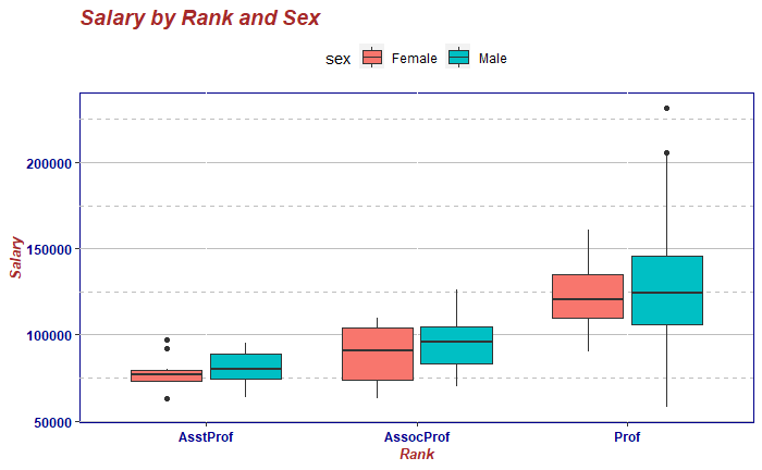
ggplot(Salaries, aes(x=rank, y=salary, fill=sex)) +
  geom_boxplot() +
  labs(
    title="Salary by Rank and Sex",
    x="Rank",
    y="Salary"
  ) +
  mytheme
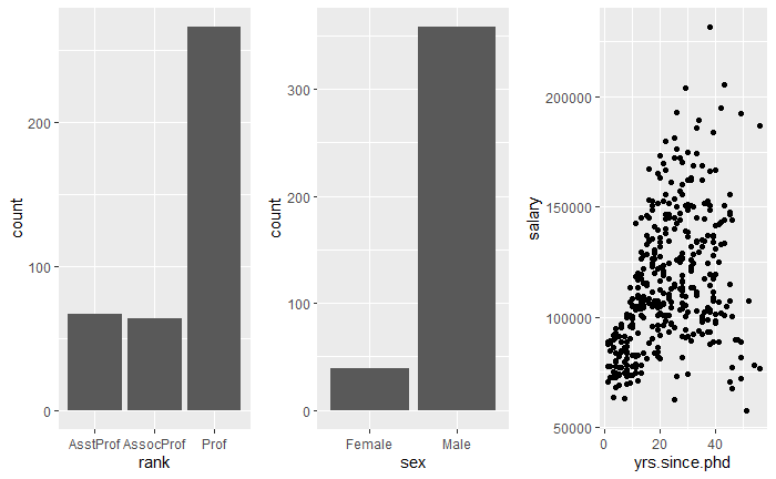
多重图
gridExtra 包中的 grid.arrange() 函数
p1 <- ggplot(data=Salaries, aes(x=rank)) + geom_bar()
p2 <- ggplot(data=Salaries, aes(x=sex)) + geom_bar()
p3 <- ggplot(data=Salaries, aes(x=yrs.since.phd, y=salary)) + geom_point()

grid.arrange(p1, p2, p3, ncol=3)
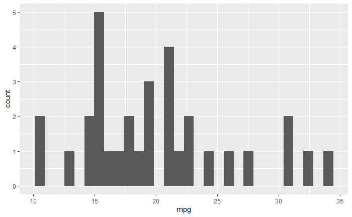
保存图形
myplot <- ggplot(mtcars, aes(x=mpg)) + geom_histogram()
ggsave(file="mygraph.png", plot=myplot, width=5, height=4)
ggplot(mtcars, aes(x=mpg)) + geom_histogram()
ggsave(file="mygraph.pdf")
参考
https://github.com/perillaroc/r-in-action-study
R 语言实战