预测雷暴旋转的基础机器学习:分类 - 属性图
本文翻译自 AMS 机器学习 Python 教程,并有部分修改。
Lagerquist, R., and D.J. Gagne II, 2019: “Basic machine learning for predicting thunderstorm rotation: Python tutorial”. https://github.com/djgagne/ams-ml-python-course/blob/master/module_2/ML_Short_Course_Module_2_Basic.ipynb.
本文接上一篇文章,介绍如何绘制属性图 (Attributes diagram) 评估二元分类问题。
示例
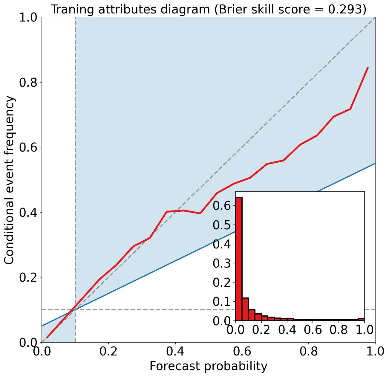
训练数据集上的 Attributes Diagram
介绍
概率预测给出事件发生的概率 (probability),其值在 0 到 1(或 0 到 100%)之间。 通常,很难验证单个概率预测。 取而代之的是,使用观察到那些事件已发生 (oi=1) 或未发生 (oi=0) 的概率来验证一组概率预测 pi。
准确的概率预测系统具有:
- reliability: 预测概率与平均观测频率之间的一致性
- sharpness: 预测概率接近于 0 或 1 的趋势,而不是围绕均值聚集的值
- resolution: 预测将样本事件集分解为具有特征不同结果的子集的能力
Reliability diagram
当包含代表气候态的 no-resolution 和 no-skill 线时被称为“attributes diagram”。
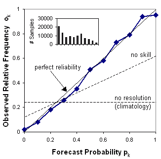
可靠性图绘制了观测频率 (observed frequency) 与预测概率 (forecast probability) 的关系图,其中预测概率的范围分为 K 个区间(例如 0-5%,5-15%,15-25%等)。 每个数据仓中的样本大小通常以直方图或数据点旁边的值的形式包含在内。
回答如下问题:事件的预测概率与观测频率的对应程度如何?
特性:
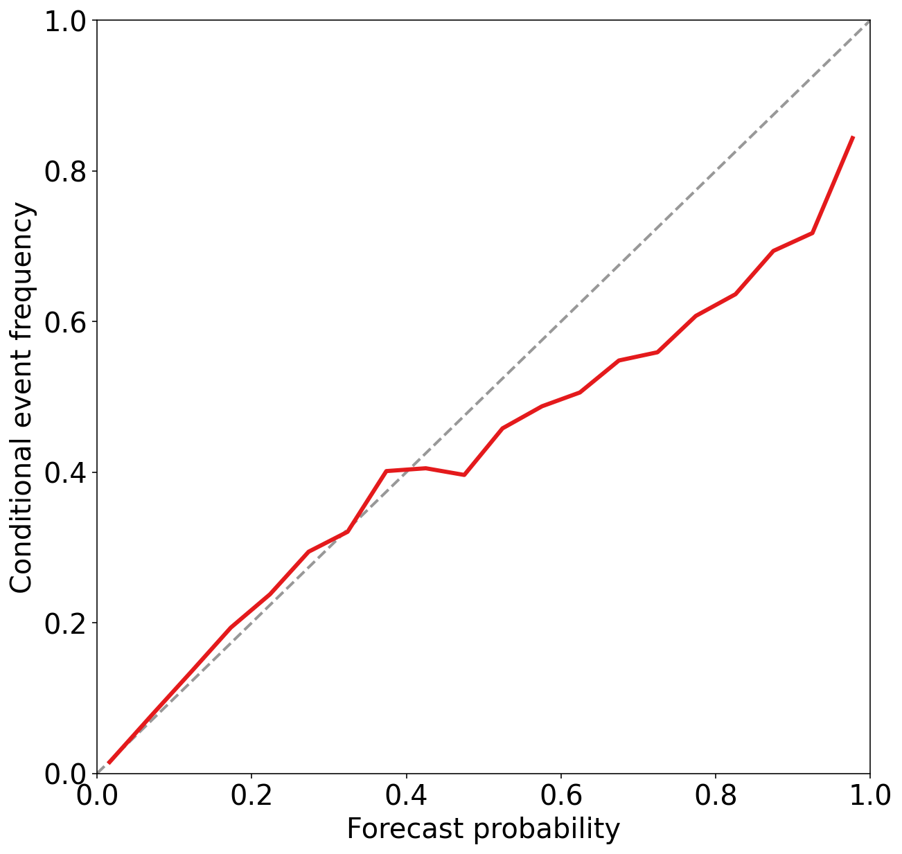
绘制曲线与对角线的接近程度表明了可靠性。 与对角线的偏差给出了条件偏差 (conditional bias)。 如果曲线位于直线下方,则表示预报过度(概率太高);线上方的点表示预测不足(概率太低)。 可靠性图中的曲线越平坦,resolution 越低。 气候预测对事件和非事件完全没有区别,因此没有 resolution。 “no-skill”线和对角线之间的点对 Brier skill score 有积极贡献。 每个概率区间中的预测频率(在直方图中显示)显示了预测的 sharpness。
可靠性图以预测为条件(即,假设已预测到某个事件,那么结果是什么?),并且可以预期其提供有关预测的真实含义的信息。 它是 ROC 的好伙伴,ROC 以观察为条件。 一些用户可能会发现 reliability table(与每个预测概率相关的观测相对频率表)比 reliability diagram 更容易理解。
Reliability diagram 计算方法
引自 A brief introduction to uncertainty calibration and reliability diagrams
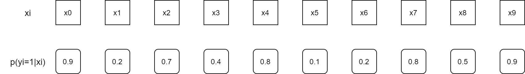
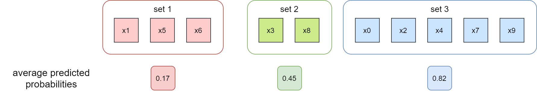
下图是 10 个样本的预测概率示意图
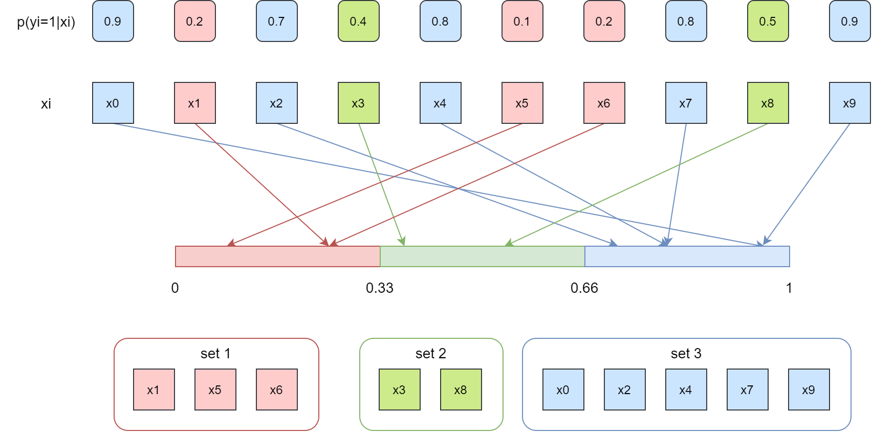
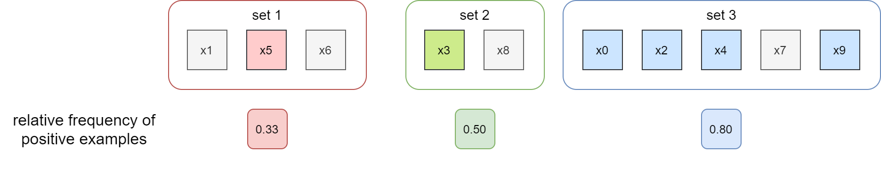
将 [0, 1] 概率区间分成 3 个子集,按照预测概率将每个样本放入对应的子集中,如下图所示
下面计算两个值:
- 预测平均概率
- 观测平均事件频率
首先计算预测平均概率
然后计算观测平均事件频率。下图中标记彩色的样本表示事件实际发生即 positive 类,灰色样本表示事件没有发生,即 negtive 类。
最后,绘制 reliability diagram,x 轴是预测平均概率,y 轴是观测平均事件频率。
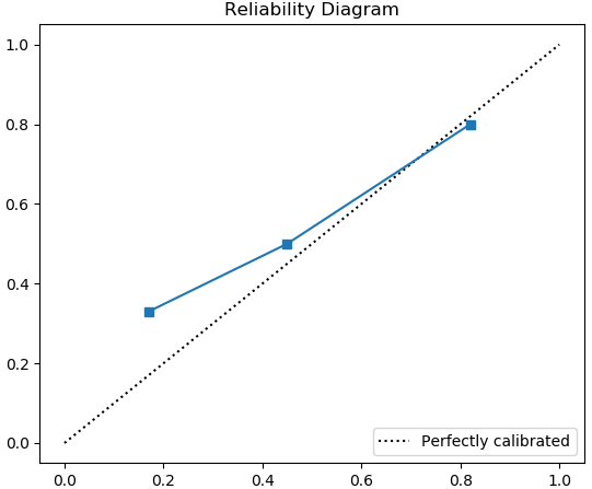
直观地,上图表明:
- 当平均预测概率为 0.17 时,约 33% 的预测为阳性;
- 当平均预测概率为 0.45 时,约 50% 的预测为阳性;
- 当平均预测概率为 0.82 时,约 80% 的预测为阳性。
尽管不是完美的,但该人为设计的模型已相对校准良好。
计算属性图数据
get_points_in_relia_curve 用于计算属性图数据,返回
- 每个桶的预测平均概率
- 每个桶的观测平均事件频率
- 每个桶的样本数
def get_points_in_relia_curve(
    observed_labels: np.ndarray,
    forecast_probabilities: np.ndarray,
    num_bins: int
) -> (np.ndarray, np.ndarray, np.ndarray):
    # 检查数据
    assert np.all(np.logical_or(
        observed_labels == 0,
        observed_labels == 1
    ))

    assert np.all(np.logical_and(
        forecast_probabilities >= 0,
        forecast_probabilities <= 1
    ))

    assert num_bins > 1

    # 获取桶序号
    inputs_to_bins = _get_histogram(
        input_values=forecast_probabilities,
        num_bins=num_bins,
        min_value=0.,
        max_value=1.
    )

    mean_forecast_probs = np.full(num_bins, np.nan)
    mean_event_frequencies = np.full(num_bins, np.nan)
    num_examples_by_bin = np.full(num_bins, -1, dtype=int)

    for k in range(num_bins):
        these_example_indices = np.where(inputs_to_bins == k)[0]

        # 每个桶的样本数
        num_examples_by_bin[k] = len(these_example_indices)

        # 每个桶的预测平均概率
        mean_forecast_probs[k] = np.mean(
            forecast_probabilities[these_example_indices])

        # 每个桶的观测平均事件频率
        mean_event_frequencies[k] = np.mean(
            observed_labels[these_example_indices].astype(float)
        )

    return mean_forecast_probs, mean_event_frequencies, num_examples_by_bin
_get_histogram 函数用于计算直方图数据,返回与输入数据相同的数组,每个值表示数据桶的序号。
已在上一部分介绍
def _get_histogram(
input_values: np.ndarray,
num_bins: int,
min_value: float,
max_value: float,
) -> np.array:
bin_cutoffs = np.linspace(
min_value,
max_value,
num=num_bins + 1
)
inputs_to_bins = np.digitize(
input_values,
bin_cutoffs,
right=False
) - 1
inputs_to_bins[inputs_to_bins < 0] = 0
inputs_to_bins[inputs_to_bins > num_bins - 1] = num_bins - 1
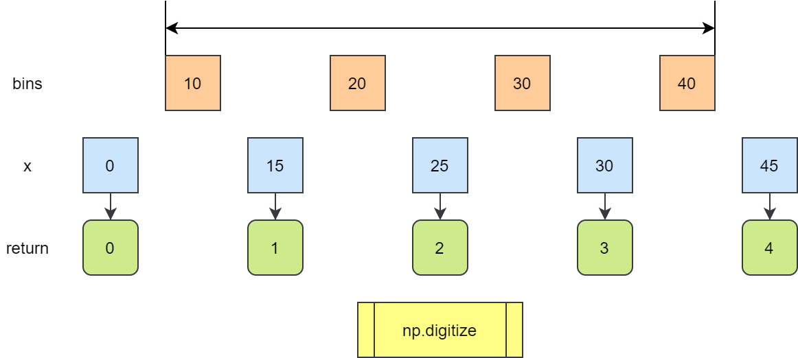
return inputs_to_bins
注:
np.digitize 函数返回输入数组中每个值所属的 bin 的索引。
默认情况下 bins[i-1] <= x < bins[i]
如果 x 超过 bins 的范围,返回 0 或者 len(bins)
绘制属性图
plot_attributes_diagram 用于绘制属性图
def plot_attributes_diagram(
    observed_labels: np.ndarray,
    forecast_probabilities: np.ndarray,
    num_bins=20,
    figure_object=None,
    axes_object=None
) -> (np.ndarray, np.ndarray, np.ndarray):
    # 计算 reliability 曲线数据
    mean_forecast_probs, mean_event_frequencies, num_examples_by_bin = (
        get_points_in_relia_curve(
            observed_labels=observed_labels,
            forecast_probabilities=forecast_probabilities,
            num_bins=num_bins
        )
    )

    if figure_object is None or axes_object is None:
        figure_object, axes_object = pyplot.subplots(
            1, 1, figsize=(10, 10)
        )

    # 绘制背景
    _plot_background(
        axes_object=axes_object,
        observed_labels=observed_labels
    )

    # 绘制样本概率分布直方图
    _plot_forecast_histogram(
        figure_object=figure_object,
        num_examples_by_bin=num_examples_by_bin
    )

    # 绘制 reliability 曲线
    plot_reliability_curve(
        observed_labels=observed_labels,
        forecast_probabilities=forecast_probabilities,
        num_bins=num_bins,
        axes_object=axes_object
    )

    return mean_forecast_probs, mean_event_frequencies, num_examples_by_bin
背景图
_plot_background 函数绘制背景图
from descartes import PolygonPatch
def _plot_background(
axes_object,
observed_labels: np.ndarray
):
# 绘制 positive-skill 区域(蓝色)
NO_SKILL_LINE_COLOUR = np.array(
[31, 120, 180],
dtype=float
) / 255
SKILL_AREA_TRANSPARENCY = 0.2
# 气候态,观察标签的平均值作为气候态
climatology = np.mean(observed_labels.astype(float))
skill_area_colour = matplotlib.colors.to_rgba(
NO_SKILL_LINE_COLOUR,
SKILL_AREA_TRANSPARENCY,
)
x_vertices_left = np.array(
[0, climatology, climatology, 0, 0]
)
y_vertices_left = np.array(
[0, 0, climatology, climatology / 2, 0]
)
left_polygon_object = _vertices_to_polygon_object(
x_vertices=x_vertices_left,
y_vertices=y_vertices_left,
)
# PolygonPatch 将 Shapely 对象当成 matplotlib 的 patch
left_polygon_patch = PolygonPatch(
left_polygon_object,
lw=0,
ec=skill_area_colour,
fc=skill_area_colour,
)
axes_object.add_patch(left_polygon_patch)
x_vertices_right = np.array(
[climatology, 1, 1, climatology, climatology]
)
y_vertices_right = np.array(
[climatology, (1 + climatology) / 2, 1, 1, climatology]
)
right_polygon_object = _vertices_to_polygon_object(
x_vertices=x_vertices_right,
y_vertices=y_vertices_right
)
right_polygon_patch = PolygonPatch(
right_polygon_object,
lw=0,
ec=skill_area_colour,
fc=skill_area_colour
)
axes_object.add_patch(right_polygon_patch)
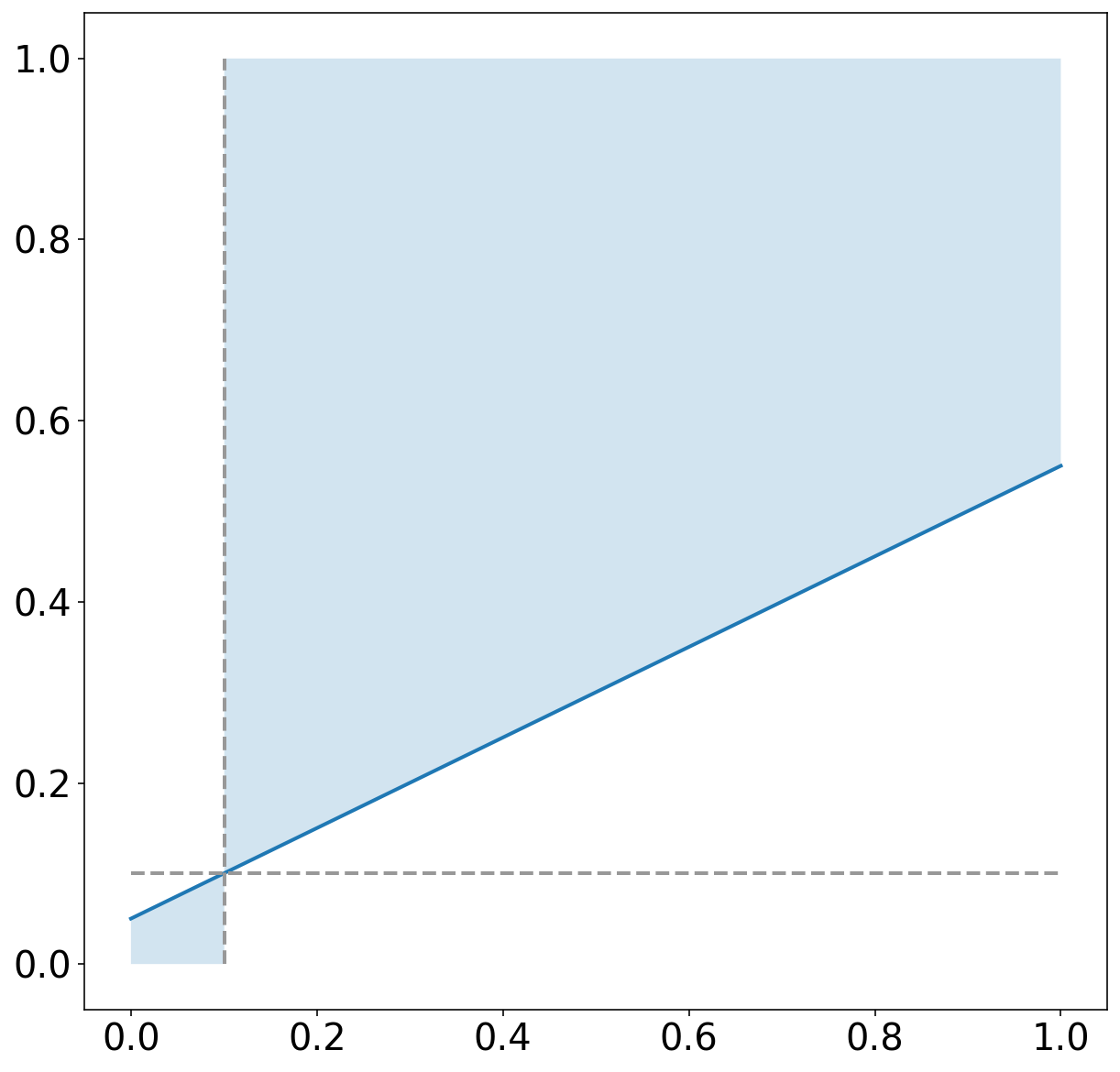
# 绘制 no-skill 线 (在 positive-skill 区域的边缘) 蓝色实线
NO_SKILL_LINE_COLOUR = np.array([31, 120, 180], dtype=float) / 255
NO_SKILL_LINE_WIDTH = 2
no_skill_x_coords = np.array([0, 1], dtype=float)
no_skill_y_coords = np.array([climatology, 1 + climatology]) / 2
axes_object.plot(
no_skill_x_coords,
no_skill_y_coords,
color=NO_SKILL_LINE_COLOUR,
linestyle='solid',
linewidth=NO_SKILL_LINE_WIDTH
)
# 绘制 climatology 线 (竖直) 灰色虚线
CLIMATOLOGY_LINE_COLOUR = np.full(3, 152. / 255)
CLIMATOLOGY_LINE_WIDTH = 2
climo_line_x_coords = np.full(2, climatology)
climo_line_y_coords = np.array([0, 1], dtype=float)
axes_object.plot(
climo_line_x_coords,
climo_line_y_coords,
color=CLIMATOLOGY_LINE_COLOUR,
linestyle='dashed',
linewidth=CLIMATOLOGY_LINE_WIDTH
)
# 绘制 no-resolution 线 (水平) 灰色虚线
no_resolution_x_coords = climo_line_y_coords + 0.
no_resolution_y_coords = climo_line_x_coords + 0.
axes_object.plot(
no_resolution_x_coords,
no_resolution_y_coords,
color=CLIMATOLOGY_LINE_COLOUR,
linestyle='dashed',
linewidth=CLIMATOLOGY_LINE_WIDTH
)
_vertices_to_polygon_object 函数将两个顶点数组转换为 shape.geometry.Polygon 对象
import shapely.geometry

def _vertices_to_polygon_object(
    x_vertices: np.ndarray,
    y_vertices: np.ndarray,
) -> shapely.geometry.Polygon:
    list_of_vertices = []

    for i in range(len(x_vertices)):
        list_of_vertices.append(
            (x_vertices[i], y_vertices[i])
        )

    return shapely.geometry.Polygon(shell=list_of_vertices)
背景图示例
fig, axes = pyplot.subplots(
    1, 1,
    figsize=(10, 10)
)
_plot_background(
    axes_object=axes,
    observed_labels=training_target_table["strong_future_rotation_flag"].values
)
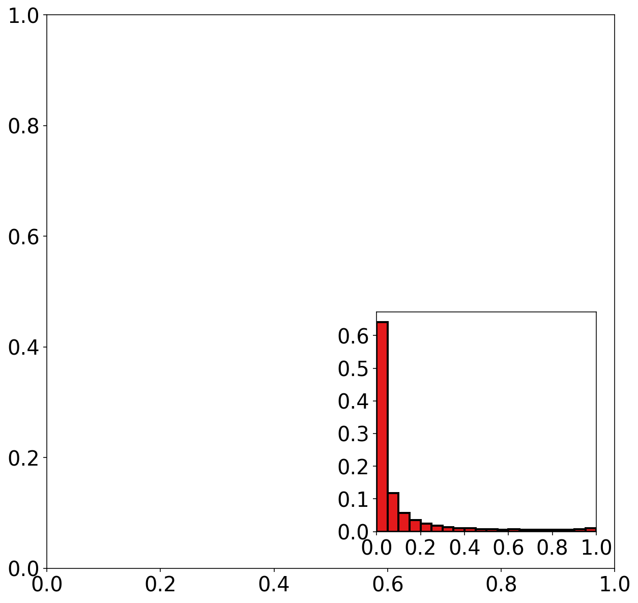
直方图
_plot_forecast_histogram 用于绘制直方图
def _plot_forecast_histogram(
    figure_object,
    num_examples_by_bin: np.ndarray
):
    # 计算频率
    num_bins = len(num_examples_by_bin)
    bin_frequencies = (
        num_examples_by_bin.astype(float) / np.sum(num_examples_by_bin)
    )

    forecast_bin_edges = np.linspace(
        0, 1,
        num=num_bins + 1,
        dtype=float
    )
    forecast_bin_width = forecast_bin_edges[1] - forecast_bin_edges[0]
    forecast_bin_centers = forecast_bin_edges[:-1] + forecast_bin_width / 2

    HISTOGRAM_LEFT_EDGE_COORD = 0.575
    HISTOGRAM_BOTTOM_EDGE_COORD = 0.175
    HISTOGRAM_WIDTH = 0.3
    HISTOGRAM_HEIGHT = 0.3

    inset_axes_object = figure_object.add_axes(
        [
            HISTOGRAM_LEFT_EDGE_COORD,
            HISTOGRAM_BOTTOM_EDGE_COORD,
            HISTOGRAM_WIDTH,
            HISTOGRAM_HEIGHT
        ]
    )

    HISTOGRAM_FACE_COLOUR = np.array([228, 26, 28], dtype=float) / 255
    HISTOGRAM_EDGE_COLOUR = np.full(3, 0.)
    HISTOGRAM_EDGE_WIDTH = 2

    # 绘制直方图
    inset_axes_object.bar(
        forecast_bin_centers,
        bin_frequencies,
        forecast_bin_width,
        color=HISTOGRAM_FACE_COLOUR,
        edgecolor=HISTOGRAM_EDGE_COLOUR,
        linewidth=HISTOGRAM_EDGE_WIDTH
    )

    # 设置标尺
    HISTOGRAM_Y_TICK_SPACING = 0.1
    max_y_tick_value = _floor_to_nearest(
        1.05 * np.max(bin_frequencies),
        HISTOGRAM_Y_TICK_SPACING
    )
    num_y_ticks = 1 + int(np.round(
        max_y_tick_value / HISTOGRAM_Y_TICK_SPACING
    ))

    y_tick_values = np.linspace(
        0, max_y_tick_value,
        num=num_y_ticks
    )
    pyplot.yticks(
        y_tick_values,
        axes=inset_axes_object
    )

    HISTOGRAM_X_TICK_VALUES = np.linspace(0, 1, num=6, dtype=float)
    pyplot.xticks(
        HISTOGRAM_X_TICK_VALUES,
        axes=inset_axes_object
    )

    inset_axes_object.set_xlim(0, 1)
    inset_axes_object.set_ylim(0, 1.05 * np.max(bin_frequencies))
_floor_to_nearest 返回接近的 increment 的倍数
def _floor_to_nearest(input_value_or_array, increment):
    return increment * np.floor(input_value_or_array / increment)
直方图示例
mean_forecast_probs, mean_event_frequencies, num_examples_by_bin = (
    get_points_in_relia_curve(
        observed_labels=training_target_table["strong_future_rotation_flag"].values,
        forecast_probabilities=training_probabilities,
        num_bins=20
    )
)

fig, axes = pyplot.subplots(
    1, 1,
    figsize=(10, 10)
)
_plot_forecast_histogram(
    figure_object=fig,
    num_examples_by_bin=num_examples_by_bin
)
可靠性曲线
plot_reliability_curve 绘制可靠性曲线
def plot_reliability_curve(
    observed_labels: np.ndarray,
    forecast_probabilities: np.ndarray,
    num_bins=20,
    axes_object=None
) -> (np.ndarray, np.ndarray, np.ndarray):
    mean_forecast_probs, mean_event_frequencies, num_examples_by_bin = (
        get_points_in_relia_curve(
            observed_labels=observed_labels,
            forecast_probabilities=forecast_probabilities, num_bins=num_bins)
    )

    # 绘制完美预报直线(45度)灰色虚线
    if axes_object is None:
        _, axes_object = pyplot.subplots(
            1, 1, figsize=(10, 10)
        )

    PERFECT_LINE_COLOUR = np.full(3, 152. / 255)
    PERFECT_LINE_WIDTH = 2
    perfect_x_coords = np.array([0, 1], dtype=float)
    perfect_y_coords = perfect_x_coords + 0.
    axes_object.plot(
        perfect_x_coords,
        perfect_y_coords,
        color=PERFECT_LINE_COLOUR,
        linestyle='dashed',
        linewidth=PERFECT_LINE_WIDTH
    )

    real_indices = np.where(np.invert(np.logical_or(
        np.isnan(mean_forecast_probs),
        np.isnan(mean_event_frequencies)
    )))[0]

    RELIABILITY_LINE_COLOUR = np.array([228, 26, 28], dtype=float) / 255
    RELIABILITY_LINE_WIDTH = 3

    # 绘制 reliability 曲线
    axes_object.plot(
        mean_forecast_probs[real_indices],
        mean_event_frequencies[real_indices],
        color=RELIABILITY_LINE_COLOUR,
        linestyle='solid',
        linewidth=RELIABILITY_LINE_WIDTH
    )

    axes_object.set_xlabel('Forecast probability')
    axes_object.set_ylabel('Conditional event frequency')
    axes_object.set_xlim(0., 1.)
    axes_object.set_ylim(0., 1.)

    return mean_forecast_probs, mean_event_frequencies, num_examples_by_bin
绘制 reliability 曲线
mean_forecast_probs, mean_event_frequencies, num_examples_by_bin = (
    get_points_in_relia_curve(
        observed_labels=training_target_table["strong_future_rotation_flag"].values,
        forecast_probabilities=training_probabilities,
        num_bins=20
    )
)

fig, axes = pyplot.subplots(
    1, 1,
    figsize=(10, 10)
)
plot_reliability_curve(
    observed_labels=training_target_table["strong_future_rotation_flag"].values,
    forecast_probabilities=training_probabilities,
    num_bins=20,
    axes_object=axes
);
实际绘制
dataset_name = "training"

# 计算 reliability 曲线数据
mean_forecast_by_bin, event_freq_by_bin, num_examples_by_bin = (
    get_points_in_relia_curve(
        observed_labels=training_target_table["strong_future_rotation_flag"].values,
        forecast_probabilities=training_probabilities,
        num_bins=20,
    )
)

# 计算 brier 评分
uncertainty = training_event_frequency * (1. - training_event_frequency)

this_numerator = np.nansum(
    num_examples_by_bin *
    (mean_forecast_by_bin - event_freq_by_bin) ** 2
)
reliability = this_numerator / np.sum(num_examples_by_bin)

this_numerator = np.nansum(
    num_examples_by_bin *
    (event_freq_by_bin - training_event_frequency) ** 2
)
resolution = this_numerator / np.sum(num_examples_by_bin)

brier_score = uncertainty + reliability - resolution
brier_skill_score = (resolution - reliability) / uncertainty

# 绘图
figure_object, axes_object = pyplot.subplots(
    1, 1,
    figsize=(10, 10)
)

plot_attributes_diagram(
    observed_labels=training_target_table["strong_future_rotation_flag"].values,
    forecast_probabilities=training_probabilities,
    num_bins=20,
    figure_object=figure_object,
    axes_object=axes_object
)

axes_object.set_title(
    f'{dataset_name} attributes diagram '
    f'(Brier skill score = {brier_skill_score:.3f})'
)
pyplot.show()
参考
https://github.com/djgagne/ams-ml-python-course
AMS 机器学习课程
数据预处理:
实际数据处理:
《AMS机器学习课程:预测雷暴旋转的基础机器学习 - 数据》
线性回归:
《AMS机器学习课程:预测雷暴旋转的基础机器学习 - 线性回归》
《AMS机器学习课程:预测雷暴旋转的基础机器学习 - 正则化》
《AMS机器学习课程:预测雷暴旋转的基础机器学习 - 超参数试验》
逻辑回归: