Bokeh教程:条形图和分类数据绘图
本文翻译自 bokeh/bokeh-notebooks 项目,并经过修改。
from bokeh.io import output_notebook, show
from bokeh.plotting import figure
output_notebook()
基本条形图
条形图是常见且重要的绘图类型。 通过 Bokeh,可以轻松创建各种堆积或嵌套的条形图,并通常处理分类数据。
下面的示例显示了一个简单的条形图,它使用 vbar 方法创建,用于绘制垂直条形图。
(有一个相应的 hbar 对应水平条。)
我们还设置了一些绘图属性以使图表看起来更好,有关视觉属性的信息,请参见《Bokeh教程:样式和主题》。
# 下面是分类数值
fruits = [
    'Apples',
    'Pears',
    'Nectarines',
    'Plums',
    'Grapes',
    'Strawberries',
]

# 将 x_range 设置为上面的分类
p = figure(
    x_range=fruits,
    plot_height=250,
    title="Fruit Counts"
)

# 分类数据同样可以用于坐标
p.vbar(
    x=fruits,
    top=[5, 3, 4, 2, 4, 6],
    width=0.9
)

# 设置属性,让绘图更美观
p.xgrid.grid_line_color = None
p.y_range.start = 0

show(p)
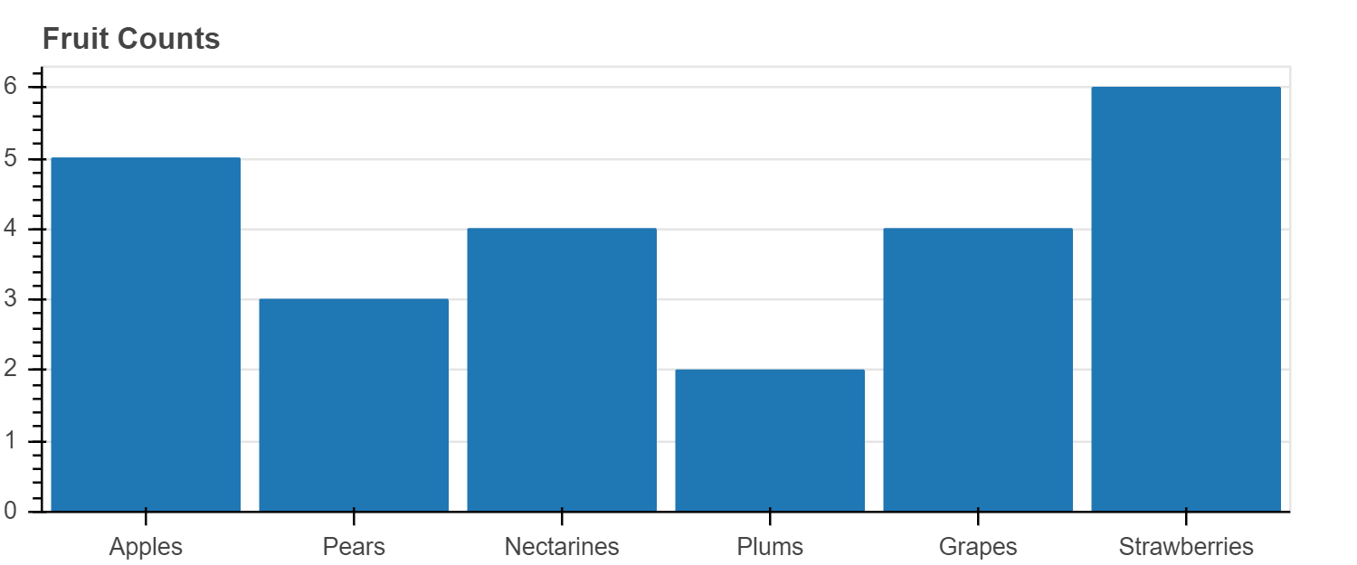
当我们想创建一个具有分类范围的图时,我们将分类值的有序列表传递给 figure,例如 x_range = ['a', 'b', 'c']。
在上面的图中,我们将水果列表传递给 x_range,我们可以看到这些水果被设置为 x 轴。
vbar glyph 方法在需要一个定位条形中心的 x 位置,一个 top,一个 bottom(默认为0),和一个 width。
当我们像这里这样使用分类范围时,每个类别的宽度隐式为 1,因此,如我们在此处设置的那样,设置 width = 0.9 会使条形图彼此分开。 (另一种选择是在范围内添加一些间隔。)
练习
创建你自己的简单条形图
由于 vbar 是一种 glyph 方法,因此我们可以将其与 ColumnDataSource 一起使用,就像我们可以与任何其他 glyph 一样。
在下面的示例中,我们将数据(包括颜色数据)放入 ColumnDataSource 中,并使用它来驱动绘图。
我们还添加了图例,有关图例和其他标注的更多信息,请参见 《Bokeh教程:添加标注》。
from bokeh.models import ColumnDataSource
from bokeh.palettes import Spectral6

fruits = [
    'Apples',
    'Pears',
    'Nectarines',
    'Plums',
    'Grapes',
    'Strawberries'
]
counts = [5, 3, 4, 2, 4, 6]

source = ColumnDataSource(
    data=dict(
        fruits=fruits,
        counts=counts,
        color=Spectral6
    )
)

p = figure(
    x_range=fruits,
    plot_height=250,
    y_range=(0, 9),
    title="Fruit Counts"
)
p.vbar(
    x='fruits',
    top='counts',
    width=0.9,
    color='color',
    legend_field="fruits",
    source=source
)

p.xgrid.grid_line_color = None
p.legend.orientation = "horizontal"
p.legend.location = "top_center"

show(p)
练习
创建自己的使用 ColumnDataSource 驱动的简单条形图
堆叠条形图
通常需要将条码堆叠在一起。
Bokeh使用 vbar_stack 和 hbar_stack 方法使这一过程变得简单。
将数据传递给这些方法之一时,堆栈中的每个“行”都应在数据源中对应一个序列。
您将提供一个列名称的有序列表,以从数据源中读取并堆叠在一起。
在下面的示例中,我们看到使用两次调用 hbar_stack 堆叠的水果出口(正值)和进口(负值)的模拟数据。
每年各列中的值是根据 fruites 排序的,即,这不是“整洁”的数据格式。
from bokeh.palettes import GnBu3, OrRd3

years = ['2015', '2016', '2017']

exports = {
    'fruits' : fruits,
    '2015'   : [2, 1, 4, 3, 2, 4],
    '2016'   : [5, 3, 4, 2, 4, 6],
    '2017'   : [3, 2, 4, 4, 5, 3]
}
imports = {
    'fruits' : fruits,
    '2015'   : [-1, 0, -1, -3, -2, -1],
    '2016'   : [-2, -1, -3, -1, -2, -2],
    '2017'   : [-1, -2, -1, 0, -2, -2]
}

p = figure(
    y_range=fruits,
    plot_height=250,
    x_range=(-16, 16),
    title="Fruit import/export, by year"
)

p.hbar_stack(
    years,
    y='fruits',
    height=0.9,
    color=GnBu3,
    source=ColumnDataSource(exports),
    legend_label=["%s exports" % x for x in years]
)

p.hbar_stack(
    years,
    y='fruits',
    height=0.9,
    color=OrRd3,
    source=ColumnDataSource(imports),
    legend_label=["%s imports" % x for x in years]
)

p.y_range.range_padding = 0.1
p.ygrid.grid_line_color = None
p.legend.location = "center_left"

show(p)
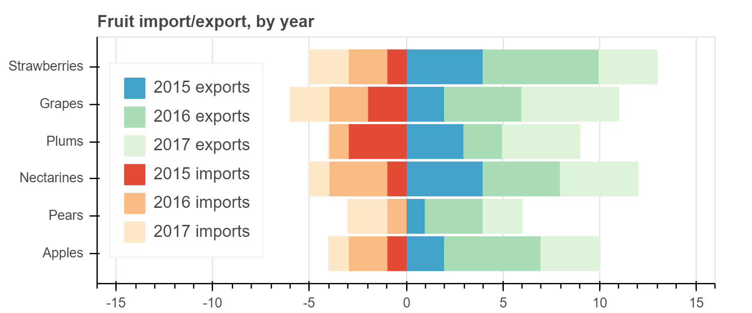
请注意,我们还通过指定以下内容在分类范围(例如,轴的两端)周围 添加了一些填充
p.y_range.range_padding = 0.1
练习
创建堆叠条形图,使用单次 vbar_stack 调用
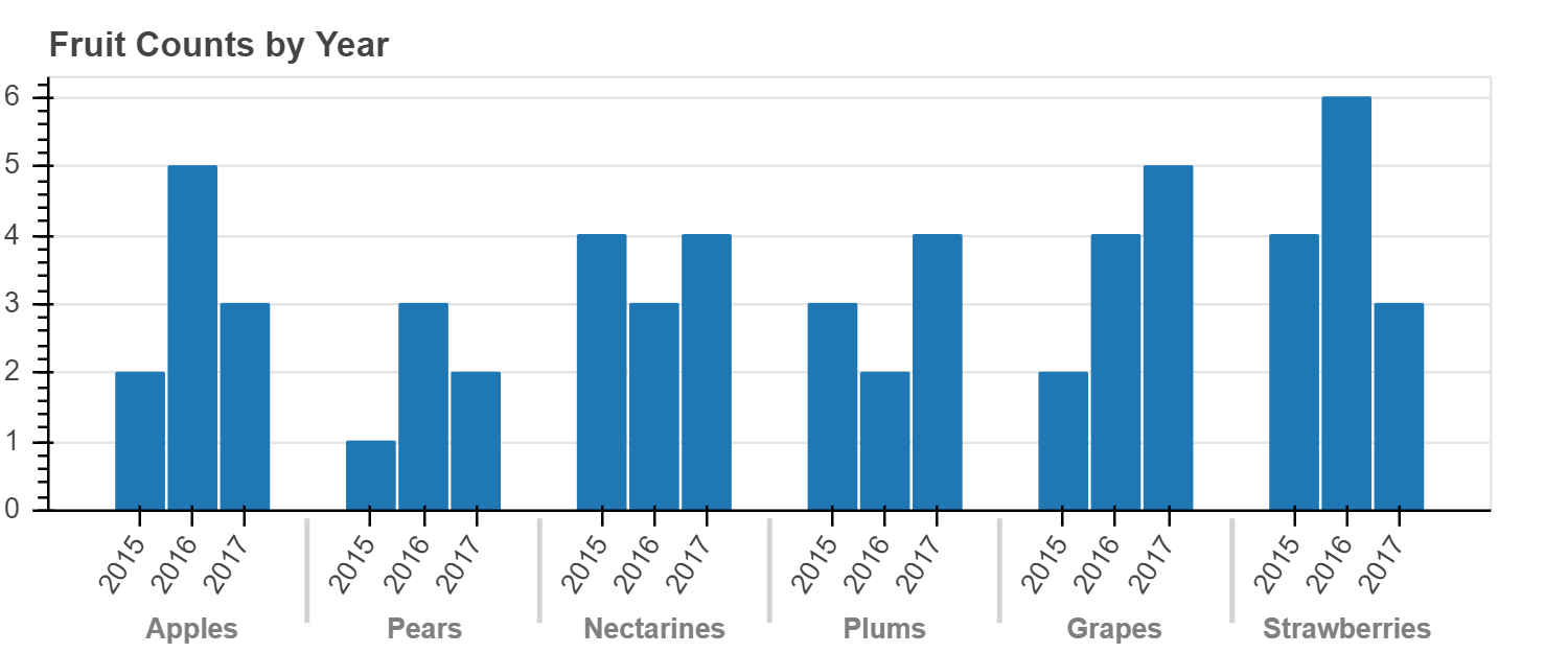
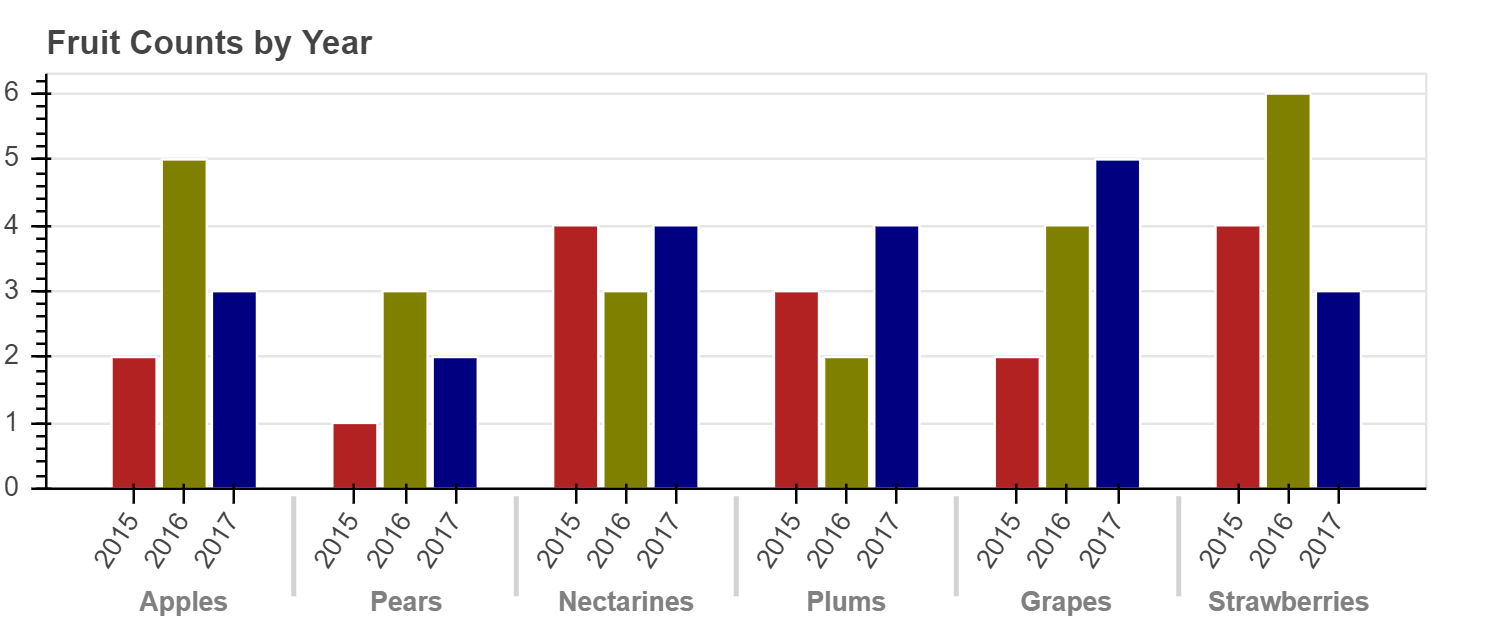
分组条形图
有时我们希望将条形图分组在一起,而不是将它们堆叠在一起。 Bokeh 最多可以处理三个级别的嵌套(层次)类别,并将根据最外面的级别自动对输出进行分组。 要指定网状分类坐标,数据源的列应包含元组,例如:
x = [
    ("Apples", "2015"),
    ("Apples", "2016"),
    ("Apples", "2017"),
    ("Pears", "2015),
    ...
]
其他列中的值对应于 x 中的每个项目,与其他情况完全相同。
当使用这些类型的嵌套坐标进行绘制时,我们必须通过将 FactorRange 显式传递给 figure 来告知 Bokeh 内容并排序轴范围。
在下面的示例中,可以看到下面的代码
p = figure(x_range=FactorRange(*x), ....)
from bokeh.models import FactorRange

fruits = [
    'Apples',
    'Pears',
    'Nectarines',
    'Plums',
    'Grapes',
    'Strawberries'
]
years = [
    '2015',
    '2016',
    '2017'
]

data = {
    'fruits' : fruits,
    '2015'   : [2, 1, 4, 3, 2, 4],
    '2016'   : [5, 3, 3, 2, 4, 6],
    '2017'   : [3, 2, 4, 4, 5, 3]
}

# this creates:
# [
#     ("Apples", "2015"),
#     ("Apples", "2016"),
#     ("Apples", "2017"),
#     ("Pears", "2015),
#     ...
# ]
x = [ (fruit, year) for fruit in fruits for year in years ]
counts = sum(
    zip(
        data['2015'],
        data['2016'],
        data['2017']
    ),
    ()
) # 类似 hstack

source = ColumnDataSource(
    data=dict(
        x=x,
        counts=counts
    )
)

p = figure(
    x_range=FactorRange(*x),
    plot_height=250,
    title="Fruit Counts by Year"
)

p.vbar(
    x='x',
    top='counts',
    width=0.9,
    source=source
)

p.y_range.start = 0
p.x_range.range_padding = 0.1
p.xaxis.major_label_orientation = 1
p.xgrid.grid_line_color = None

show(p)
练习
通过为 ColumnDataSource 添加颜色,使上面的图表每年具有不同的颜色
我们可以设置条形颜色的另一种方法是使用变换。
我们在上一章 《Bokeh教程:数据源和转换》 中首先看到了一些转换。
在这里,我们使用一个新的 factor_cmap,它接受要用于颜色映射的列的名称,以及定义颜色映射的调色板和因子。
另外,如果需要,我们可以将其配置为仅映射子因子。
例如,在这种情况下,我们不想给每个 (fruit, year) 对的颜色不同。
取而代之的是,我们只希望基于 year 进行着色。
因此,我们传递 start = 1 和 end = 2 来指定颜色映射时要使用的每个因子的范围。
然后我们将结果传递为 fill_color 值:
fill_color=factor_cmap(
    'x',
    palette=['firebrick', 'olive', 'navy'],
    factors=years,
    start=1,
    end=2
)
from bokeh.transform import factor_cmap

p = figure(
    x_range=FactorRange(*x),
    plot_height=250,
    title="Fruit Counts by Year"
)

p.vbar(
    x='x',
    top='counts',
    width=0.9,
    source=source,
    line_color="white",

    # 使用调色板基于 x[1:2] 值进行颜色映射
    fill_color=factor_cmap(
        'x',
        palette=['firebrick', 'olive', 'navy'],
        factors=years,
        start=1,
        end=2
    )
)

p.y_range.start = 0
p.x_range.range_padding = 0.1
p.xaxis.major_label_orientation = 1
p.xgrid.grid_line_color = None

show(p)
也可以使用另一种称为 “视觉闪避(visual dodge)” 的技术来实现分组条形图。 如果您只想用水果类型标记轴,而不在轴上包括年份,该技术会很有用。 本教程不涉及该技术,但是您可以在 用户指南中找到信息。
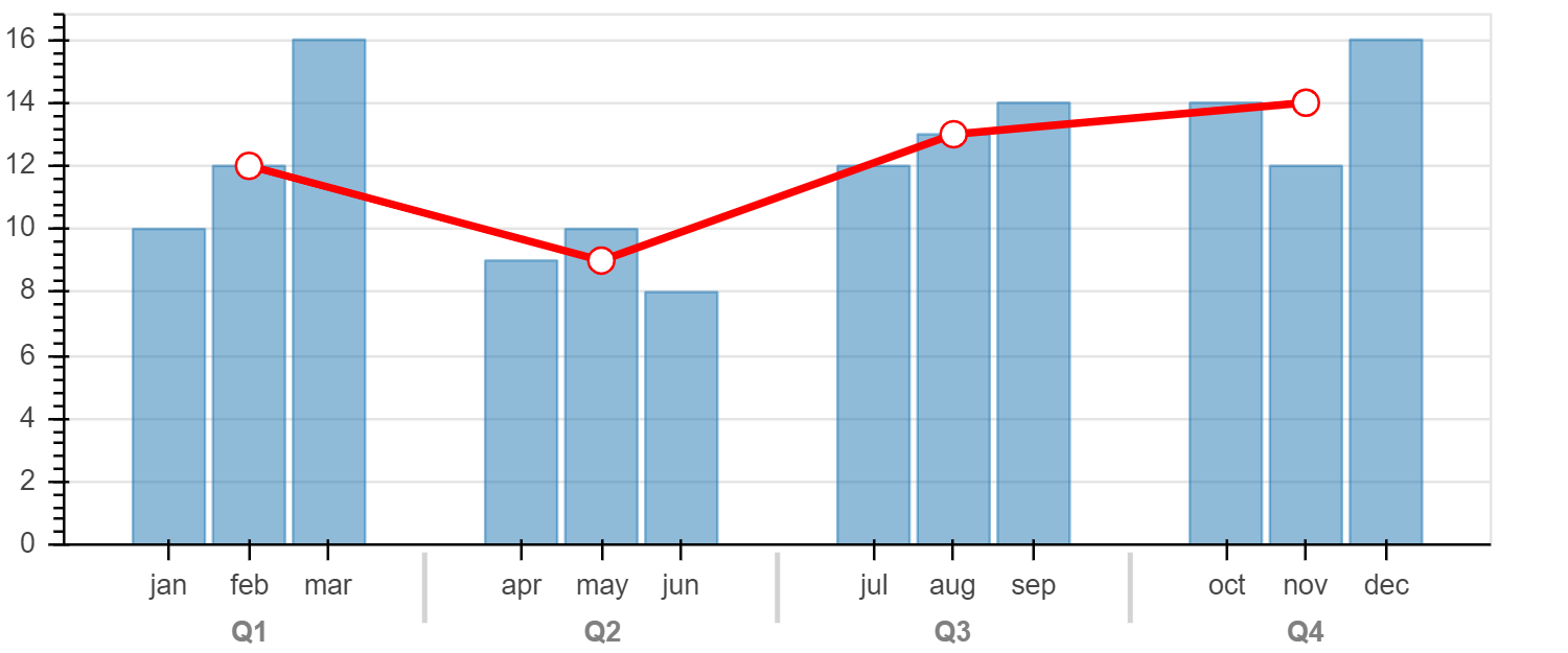
混合分类级别
如果您使用上述嵌套类别创建了范围,则可以根据需要仅使用“外部”类别来绘制 glyphs。 下图显示了按季度划分的月度值条形图。 这些数据的格式为:
factors = [("Q1", "jan"), ("Q1", "feb"), ("Q1", "mar"), ....]
该图还覆盖了代表平均季度值的线,这可以通过仅使用每个下一个类别的“季度”部分来完成:
p.line(x=["Q1", "Q2", "Q3", "Q4"], y=....)
factors = [
    ("Q1", "jan"), ("Q1", "feb"), ("Q1", "mar"),
    ("Q2", "apr"), ("Q2", "may"), ("Q2", "jun"),
    ("Q3", "jul"), ("Q3", "aug"), ("Q3", "sep"),
    ("Q4", "oct"), ("Q4", "nov"), ("Q4", "dec")
]

p = figure(
    x_range=FactorRange(*factors),
    plot_height=250
)

x = [
    10, 12, 16,
    9, 10, 8,
    12, 13, 14,
    14, 12, 16
]
p.vbar(
    x=factors,
    top=x,
    width=0.9,
    alpha=0.5
)

qs, aves = ["Q1", "Q2", "Q3", "Q4"], [12, 9, 13, 14]
p.line(
    x=qs,
    y=aves,
    color="red",
    line_width=3
)
p.circle(
    x=qs,
    y=aves,
    line_color="red",
    fill_color="white",
    size=10
)

p.y_range.start = 0
p.x_range.range_padding = 0.1
p.xgrid.grid_line_color = None

show(p)
使用 Pandas GroupBy
我们可能要根据 “group by” 操作的结果制作图表。
Bokeh 可以直接利用 Pandas GroupBy 对象来简化此过程。
让我们通过检查“汽车”数据集来了解 Bokeh 如何处理 GroupBy 对象。
from bokeh.sampledata.autompg import autompg_clean as df

df.cyl = df.cyl.astype(str)
df.head()
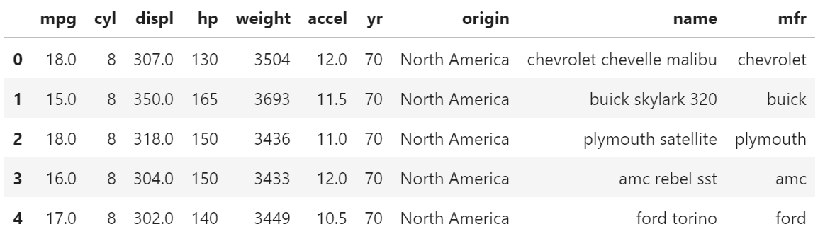
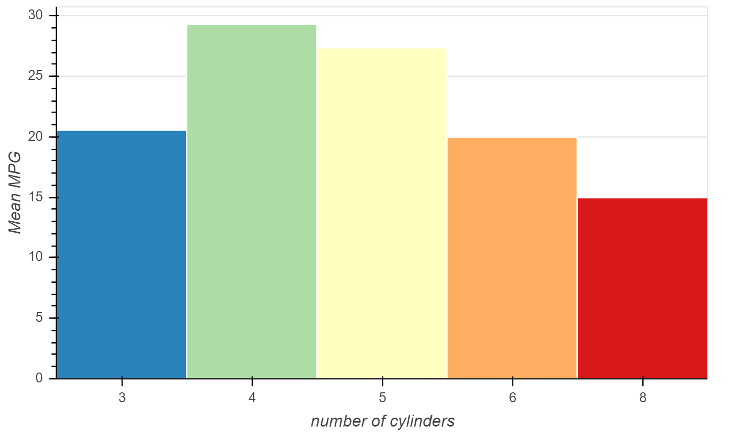
假设我们要显示一些根据 "cyl" 分组的值。
如果我们创建 df.groupby(('cyl')) 然后调用 group.describe(),我们可以看到 Pandas 自动为每个组计算各种统计信息。
group = df.groupby(('cyl'))

group.describe()
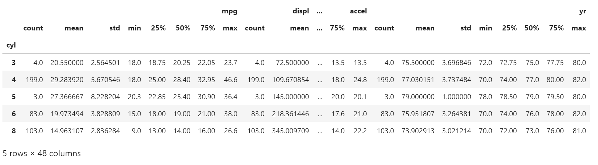
Bokeh 允许我们直接从 Pandas 的 GroupBy 对象创建一个 ColumnDataSource,当发生这种情况时,数据源将自动填充来自 group.desribe() 的摘要值。
观察下面的列名,它们与上面的输出相对应。
source = ColumnDataSource(group)

",".join(source.column_names)
‘cyl,mpg_count,mpg_mean,mpg_std,mpg_min,mpg_25%,mpg_50%,mpg_75%,mpg_max,displ_count,displ_mean,displ_std,displ_min,displ_25%,displ_50%,displ_75%,displ_max,hp_count,hp_mean,hp_std,hp_min,hp_25%,hp_50%,hp_75%,hp_max,weight_count,weight_mean,weight_std,weight_min,weight_25%,weight_50%,weight_75%,weight_max,accel_count,accel_mean,accel_std,accel_min,accel_25%,accel_50%,accel_75%,accel_max,yr_count,yr_mean,yr_std,yr_min,yr_25%,yr_50%,yr_75%,yr_max’
了解了这些列名后,我们可以立即基于 Pandas GroupBy 对象创建条形图。
下面的示例绘制了每个气缸的平均 MPG,即 "mpg_mean" 列与 "cyl" 列
from bokeh.palettes import Spectral5

cyl_cmap = factor_cmap(
    'cyl',
    palette=Spectral5,
    factors=sorted(df.cyl.unique())
)

p = figure(
    plot_height=350,
    x_range=group)
p.vbar(
    x='cyl',
    top='mpg_mean',
    width=1,
    line_color="white",
    fill_color=cyl_cmap,
    source=source
)

p.xgrid.grid_line_color = None
p.xaxis.axis_label = "number of cylinders"
p.yaxis.axis_label = "Mean MPG"
p.y_range.start = 0

show(p)
练习
使用相同的数据集按起点绘制相似的平均马力(hp)图
分类散点图
到目前为止,我们已经看到分类数据与各种条形 glyphs 一起使用。
但是 Bokeh 可以对大多数 glyphs 使用分类坐标。
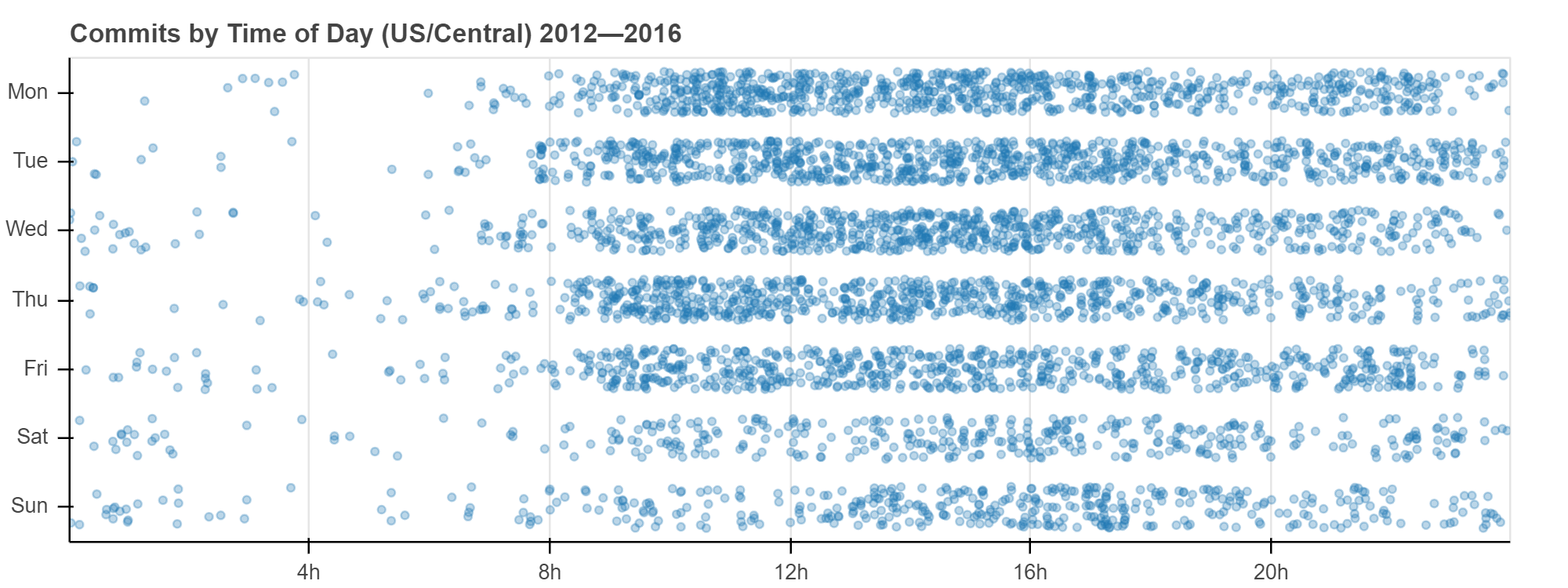
让我们创建在一个轴上具有分类坐标的散点图。
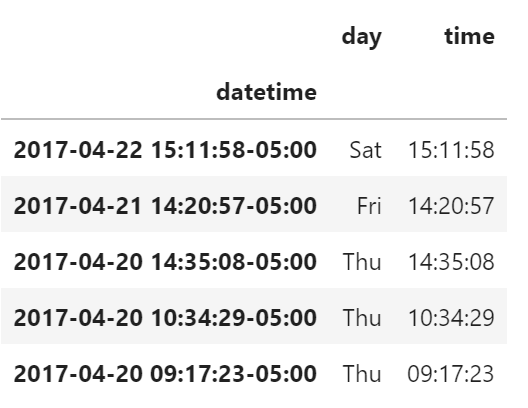
commits 数据集只包含一系列 GitHub commit 的日期时间。
已经添加了其他列来表示每次提交的日期和时间。
from bokeh.sampledata.commits import data

data.head()
要创建散点图,我们像以前一样将类别列表作为范围传递
p = figure(y_range=DAYS, ...)
然后,我们可以为每次提交绘制圆点,其中 "time" 驱动 x 坐标,而 "day" 驱动 y 坐标。
p.circle(x='time', y='day', ...)
为了使这些值更容易区分,我们还可以向 y 坐标添加一个 jitter 变换,如下面的完整示例所示。
from bokeh.transform import jitter

DAYS = ['Sun', 'Sat', 'Fri', 'Thu', 'Wed', 'Tue', 'Mon']

source = ColumnDataSource(data)

p = figure(
    plot_width=800,
    plot_height=300,
    y_range=DAYS,
    x_axis_type='datetime',
    title="Commits by Time of Day (US/Central) 2012—2016"
)

p.circle(
    x='time',
    y=jitter(
        'day',
        width=0.6,
        range=p.y_range
    ),
    source=source,
    alpha=0.3
)

p.xaxis[0].formatter.days = ['%Hh']
p.x_range.range_padding = 0
p.ygrid.grid_line_color = None

show(p)
练习
使用分类坐标和任何非 “bar” glyphs 创建图