Bokeh教程:添加标注
本文翻译自 bokeh/bokeh-notebooks 项目,并经过修改。
概述
有时我们想要添加视觉提示(边界线,阴影区域,标签和箭头等等),以突出某些特性。
Bokeh 有几种可用的标注类型。
通常,为了添加标注,我们直接创建“底层”标注对象,使用 add_layout 添加到图形中。
让我们看一些具体的示例。
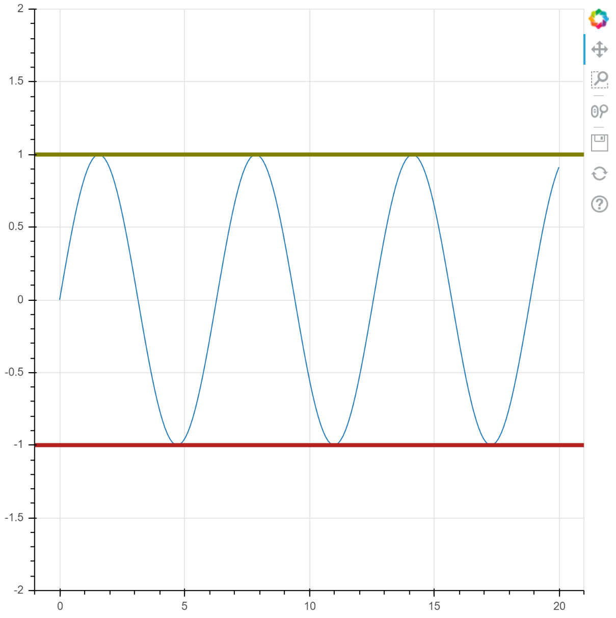
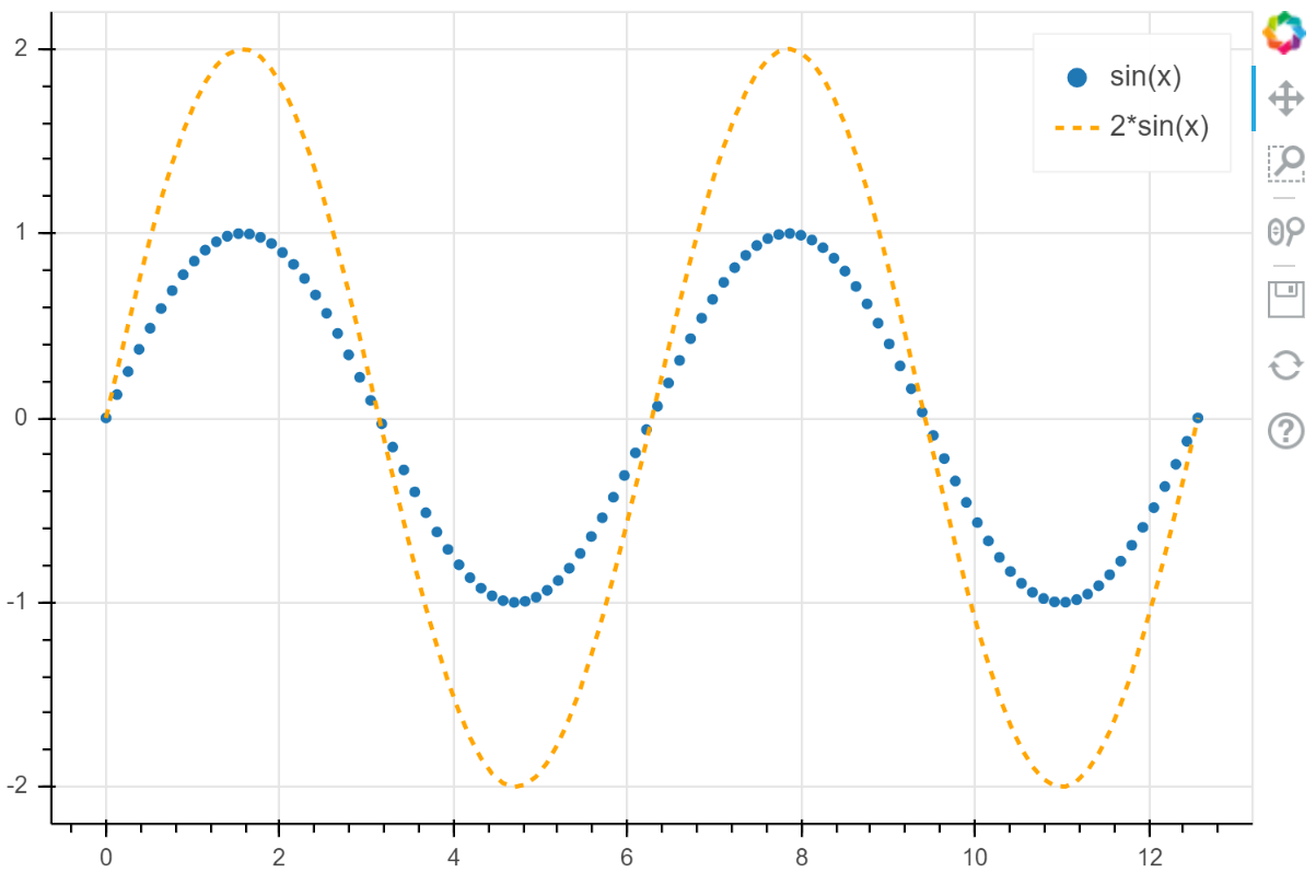
Spans
Spans 是 “无限” 的竖直或水平直线。
创建它们时,需要指定想要跨越的维度(例如,width 或 height),任何线条属性和线条在被绘制的维度上的位置。
让我们看一个示例,添加两条水平直线到一个简单的绘图中。
import numpy as np
from bokeh.models.annotations import Span

x = np.linspace(0, 20, 200)
y = np.sin(x)

p = figure(y_range=(-2, 2))
p.line(x, y)

upper = Span(
    location=1,
    dimension="width",
    line_color="olive",
    line_width=4
)
p.add_layout(upper)

lower = Span(
    location=-1,
    dimension="width",
    line_color="firebrick",
    line_width=4,
)
p.add_layout(lower)

show(p)
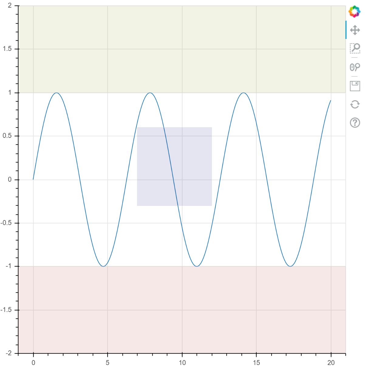
Box Annotations
有时想要画一个阴影方框来突出绘图中的某个区域。
可以通过 BoxAnnotation 实现,使用下面的坐标属性来配置:
topleftbottomright
也可以使用任何线条和填充属性控制外观。
“无限” 方框可以通过不指定某个坐标来实现,例如,如果没有指定 top,方框将延伸到绘图区域的顶部,而不管是否发生平移或缩放。
让我们看一个示例,向绘图中添加一些方框。
import numpy as np
from bokeh.models.annotations import BoxAnnotation

x = np.linspace(0, 20, 200)
y = np.sin(x)

p = figure(y_range=(-2, 2))
p.line(x, y)

# 填充绘图区域顶部的区域
upper = BoxAnnotation(
    bottom=1,
    fill_alpha=0.1,
    fill_color="olive",
)
p.add_layout(upper)

# 填充绘图区域的底部
lower = BoxAnnotation(
    top=-1,
    fill_alpha=0.1,
    fill_color="firebrick",
)
p.add_layout(lower)

# 有限区域
center = BoxAnnotation(
    top=0.6,
    bottom=-0.3,
    left=7,
    right=12,
    fill_alpha=0.1,
    fill_color="navy",
)
p.add_layout(center)

show(p)
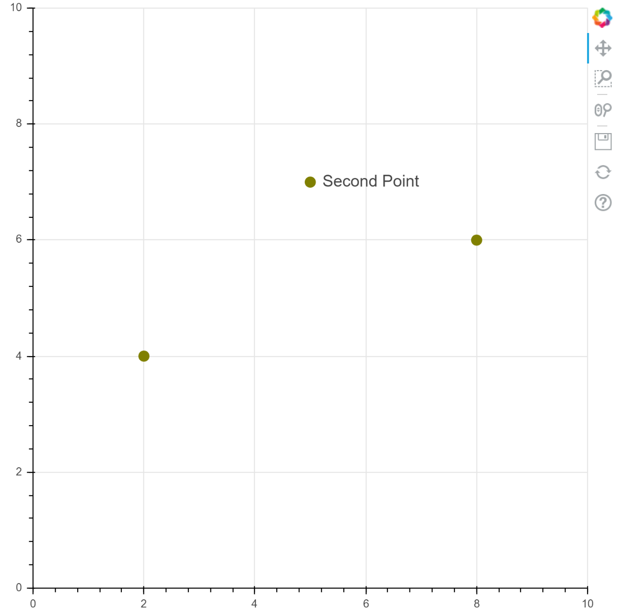
Label
Label 标注允许您轻松地将单个文本标签添加到绘图中。
位置和显示的文本由 x,y 和 text 设置:
Label(x=10, y=5, text="Some Label")
默认情况下,单位是 “数据空间”,但是 x_units 和 y_units 可以设置为 “screen”,使用相对于画布的位置放置标签。
标签可以接受 x_offset 和 y_offset,通过指定偏移x 和 y 的屏幕空间距离来设置最终位置。
Label 对象接受标准文本,线条(border_line)和填充(background_fill)属性。
线条和填充属性应用在包围文本的边框上。
Label(
    x=10,
    y=5,
    text="Some Label",
    text_font_size="12pt",
    border_line_color="red",
    background_fill_color="blue",
)
from bokeh.models.annotations import Label
from bokeh.plotting import figure

p = figure(
    x_range=(0, 10),
    y_range=(0, 10)
)
p.circle(
    [2, 5, 8],
    [4, 7, 6],
    color="olive",
    size=10,
)

label = Label(
    x=5,
    y=7,
    x_offset=12,
    text="Second Point",
    text_baseline="middle",
)
p.add_layout(label)

show(p)
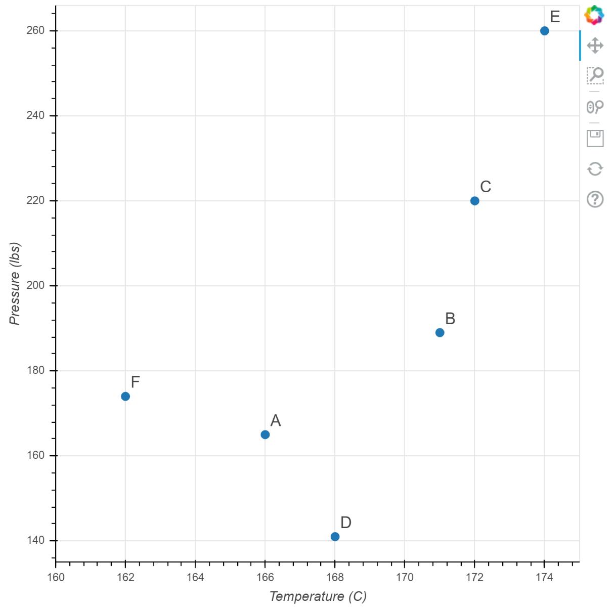
LabelSet
LabelSet 标注允许您同时创建多个标签,例如,为整个散点图的标记添加标签。
它们类似 Label,但可以接收 ColumnDataSource 作为 source 属性,然后 x 和 y 可以指示数据源中的列名,例如 x="col2"(但是,仍然可以使用固定值,例如 x=10)。
from bokeh.plotting import figure
from bokeh.models import ColumnDataSource, LabelSet

source = ColumnDataSource(
    data=dict(
        temp=[166, 171, 172, 168, 174, 162],
        pressure=[165, 189, 220, 141, 260, 174],
        names=["A", "B", "C", "D", "E", "F"]
    )
)

p = figure(x_range=(160, 175))
p.scatter(
    x="temp",
    y="pressure",
    size=8,
    source=source,
)
p.xaxis.axis_label = "Temperature (C)"
p.yaxis.axis_label = "Pressure (lbs)"

labels = LabelSet(
    x="temp",
    y="pressure",
    text="names",
    level="glyph",
    x_offset=5,
    y_offset=5,
    source=source,
    render_mode="canvas",
)
p.add_layout(labels)

show(p)
Arrows
Arrow 标注可以指出绘图中的不同内容,在与标签组合时尤其有用。
例如创建一个从 (0,0) 指向 (1,1) 的箭头:
p.add_layout(Arrow(x_start=0, y_start=0, x_end=1, y_end=1))
这个箭头在箭头末端有默认的 OpenHead。
其他种类的箭头端包括 NormalHead 和 VeeHead。
箭头端类型可以通过 Arrow 对象的 start 和 end 属性设置。
p.add_layout(Arrow(
    start=OpenHead(),
    end=VeeHead(),
    x_start=0,
    y_start=0,
    x_end=1,
    y_end=0
))
这将创建一个双向箭头,起始端是一个“open”箭头,结尾端是一个“v”箭头。 箭头具有标准的线条和填充属性集来控制它们的外观。 下面是一个示例
OpenHead(line_color="firebrick", lin_width=4)
下面的代码和绘图展示几种配置。
from bokeh.models.annotations import Arrow
from bokeh.models.arrow_heads import OpenHead, NormalHead, VeeHead

p = figure(
    plot_width=600,
    plot_height=600,
)

p.circle(
    x=[0, 1, 0.5],
    y=[0, 0, 0.7],
    radius=0.1,
    color=["navy", "yellow", "red"],
    fill_alpha=0.1
)

p.add_layout(Arrow(
    end=OpenHead(line_color="firebrick", line_width=4),
    x_start=0,
    y_start=0,
    x_end=1,
    y_end=0
))

p.add_layout(Arrow(
    end=NormalHead(fill_color="orange"),
    x_start=1,
    y_start=0,
    x_end=0.5,
    y_end=0.7
))

p.add_layout(Arrow(
    end=VeeHead(size=35),
    line_color="red",
    x_start=0.5,
    y_start=0.7,
    x_end=0,
    y_end=0
))

show(p)
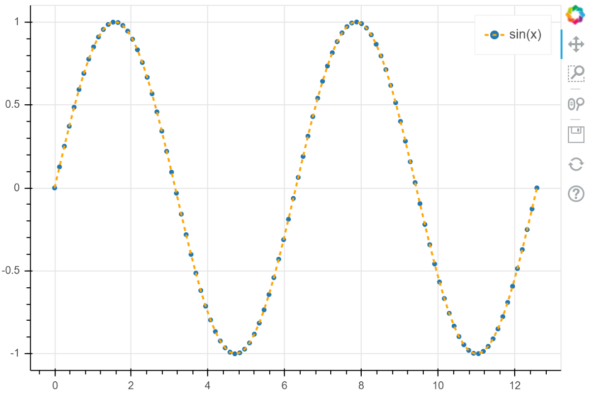
Legends
绘图中有多个 glyphs 时,最好包含一个图例来帮助用户解释他们看到的内容。 Bokeh 可以根据添加的 glyphs 轻松生成图例。
Simple Legends
最简单的情况下,可以简单地将一个字符串传递给 glyph 函数的 legend_label 参数:
p.circle(x, y, legend_label="sin(x)")
这种情况下,Bokeh 会自动创建图例,显示 glyph 的表现形式,并加上您提供的文本标签。 下面是一个完整的示例。
import numpy as np

x = np.linspace(0, 4*np.pi, 100)
y = np.sin(x)

p = figure(height=400)

p.circle(
    x, y,
    legend_label="sin(x)",
)
p.line(
    x, 2*y,
    legend_label="2*sin(x)",
    line_dash=[4, 4],
    line_color="orange",
    line_width=2,
)

show(p)
Compound legends
上面的示例中,我们为每个 glyph 方法提供不同的图例标签。
有时,两个或更多的不同 glyph 使用同一个数据源。
这种情况下,可以通过在创建绘图时为多个 glyph 方法指定相同的图例参数来创建复合图例。
例如,如果您同时使用线条和标记符号绘制 sin 曲线,可以给它们相同的标签,使它们在图例中一同出现。
p.circle(x, y, legend_label="sin(x)")
p.line(x, y, legend_label="sin(x)", line_dash=[4, 4], line_color="orange", line_width=2)
练习:
- 创建一个复合图例
- 使用
p.legend.location放置图例。可用的值可以参考:https://bokeh.pydata.org/en/latest/docs/reference/core/enums.html#bokeh.core.enums.Anchor
import numpy as np

x = np.linspace(0, 4*np.pi, 100)
y = np.sin(x)

p = figure(height=400)

p.circle(
    x, y,
    legend_label="sin(x)"
)

p.line(
    x, y,
    legend_label="sin(x)",
    line_dash=[4, 4],
    line_color="orange",
    line_width=2
)

p.legend.location = "top_right"

show(p)
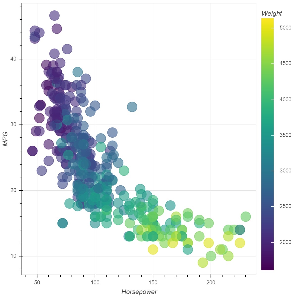
Color bars
如果我们使用某种颜色映射关系改变 glyph 的颜色,那么颜色条尤其有用。
Boken 的颜色条由颜色映射器配置,并使用 add_layout 方法添加到绘图中。
color_mapper = LinearColorMapper(
    palette="Viridis256",
    low=data_low,
    high=data_high
)

color_bar = ColorBar(
    color_mapper=color_mapper,
    location=(0,0)
)

p.add_layout(color_bar, 'right')
下面是一个完整的示例,同时还使用颜色映射器转换 glyph 颜色。
from bokeh.sampledata.autompg import autompg
from bokeh.models import LinearColorMapper, ColorBar
from bokeh.transform import transform

source = ColumnDataSource(autompg)
color_mapper = LinearColorMapper(
    palette="Viridis256",
    low=autompg.weight.min(),
    high=autompg.weight.max(),
)

p = figure(
    x_axis_label="Horsepower",
    y_axis_label="MPG",
    tools="",
    toolbar_location=None
)

p.circle(
    x="hp",
    y="mpg",
    color=transform("weight", color_mapper),
    size=20,
    alpha=0.6,
    source=autompg,
)

color_bar = ColorBar(
    color_mapper=color_mapper,
    label_standoff=12,
    location=(0, 0),
    title="Weight",
)
p.add_layout(color_bar, "right")

show(p)
实战
之前的文章《统计数值天气预报模式产品生成的典型时间》根据 GRIB 2 文件的创建时间统计产品生成的典型时间,并使用 bokeh 绘制了 000 时效一个月的产品生成时间图。
下面根据本文介绍的方法,在该绘图中添加一些标记。
导入需要的库。
from pathlib import Path

import pandas as pd
import numpy as np
from nwpc_data.data_finder import find_local_file
获取 240h 时效的文件路径列表
date_range = pd.date_range("2020-03-01 00:00:00", "2020-03-31 00:00:00", freq="D")
file_list=[
    find_local_file(
        "model_A/grib2/orig",
        start_time=t,
        forecast_time="240h"
    )
    for t
    in date_range
]
计算文件生成时间。
ts = [pd.to_datetime(Path(f).stat().st_mtime_ns) - pd.to_datetime(d.date())  for f, d in zip(file_list, date_range) ]
s = pd.Series(ts, name="clock", index=date_range)
df = s.to_frame()
计算统计量
mean_clock = s.mean().ceil("s")
median_clock = s.median()
std = s.std().ceil("s")
std
Timedelta('0 days 00:17:56')
计算切尾均值和方差
count = len(df)
trimmed_s = df.sort_values("clock")[int(count*0.1):int(count*0.9)]
trimmed_mean = trimmed_s.mean().loc["clock"].ceil("s")
trimmed_std = trimmed_s.std().loc["clock"].ceil("s")
trimmed_std
Timedelta('0 days 00:06:15')
判断生成时间是否异常。
trimmed_upper_value = trimmed_mean + trimmed_std
upper_value = trimmed_mean + std

def get_status(clock):
    if clock > upper_value:
        return "late"
    elif clock > trimmed_upper_value:
        return "warn"
    else:
        return "normal"

df["status"] = df["clock"].map(get_status)
df["start_time"] = df.index.map(lambda x: x.strftime("%m/%d"))
df
准备绘图数据,筛选 late 类型的点用于后续添加标签。
from bokeh.io import output_notebook, show
from bokeh.plotting import figure
output_notebook()

from bokeh.transform import factor_cmap
from bokeh.palettes import Accent3

from bokeh.models.sources import ColumnDataSource
source = ColumnDataSource(df)

late_source = ColumnDataSource(df[df.status=="late"])
绘制图像,使用不同颜色区分不同类型的数据点,并添加线条、方框和标签。
from bokeh.models.annotations import Span
from bokeh.models import BoxAnnotation, ColorBar, LabelSet

data = s
p = figure(
    plot_width=1000,
    plot_height=600,
    y_axis_type="datetime",
    x_axis_type="datetime",
    title="MODEL A GRIB2 ORIG forecast 240h"
)

l = p.circle(
    "index",
    "clock",
    size=5,
    source=source,
    color=factor_cmap(
        'status',
        palette=Accent3,
        factors=['normal', 'warn', 'late'],
    ),
)

p.xaxis.axis_label = "date"
p.yaxis.axis_label = "clock"

upper = BoxAnnotation(
    bottom=upper_value,
    fill_alpha=0.1,
    fill_color="yellow",
)
p.add_layout(upper)

trimmed_upper = Span(
    location=trimmed_upper_value,
    dimension="width",
    line_color="orange",
    line_width=1
)
p.add_layout(trimmed_upper)

trimmed_line = Span(
    location=trimmed_mean,
    dimension="width",
    line_color="green",
    line_width=1,
)
p.add_layout(trimmed_line)

labels = LabelSet(
    x="index",
    y="clock",
    text="start_time",
    level="glyph",
    x_offset=5,
    y_offset=5,
    source=late_source,
    render_mode="canvas",
)
p.add_layout(labels)

show(p)
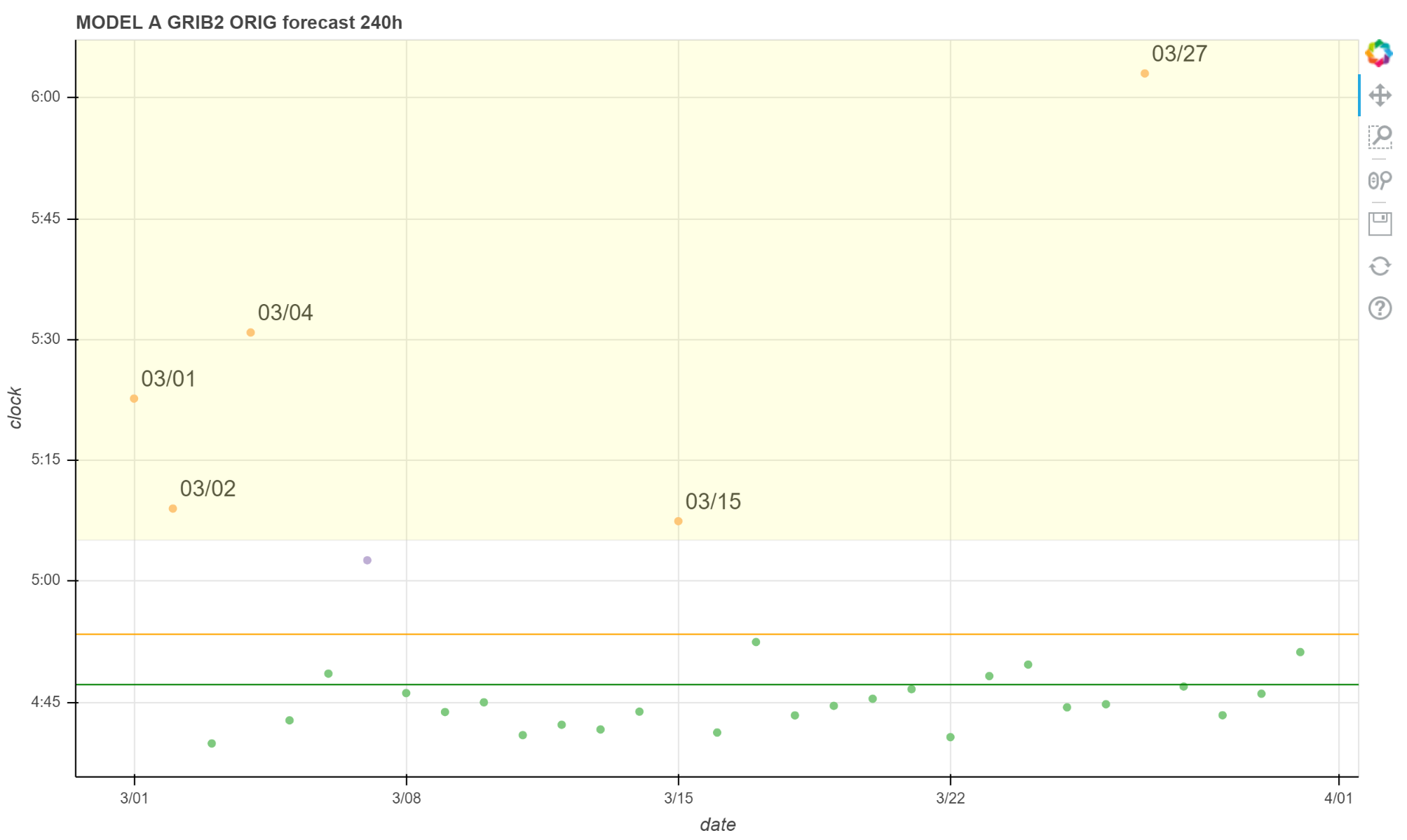
图中绿色点是正常时间;紫色点是值得关注的延迟情况,但也归于正常范围;黄色点是异常的延迟情况,应该发出告警信息。
绿色线是切尾均值,黄色线是切尾均值 + 切尾后的标准差,黄色区域的点大于切尾均值 + 全部数据标准差。 图中所有黄色区域的点都标注了日期。