Bokeh教程:数据源和转换
本文翻译自 bokeh/bokeh-notebooks 项目,并经过修改。
导入和安装
首先进行标准导入
from bokeh.io import output_notebook, show
from bokeh.plotting import figure
output_notebook()
本章节使用Bokeh示例数据。 如果尚未下载,可以通过运行以下命令下载:
import bokeh.sampledata
bokeh.sampledata.download()
概述
我们已经看到 Bokeh 如何与 Python 列表,NumPy 数组,Pandas series 等一起很好地工作。
在底层,这些输入被转换为 Bokeh ColumnDataSource。
此数据类型是 Bokeh 中使用的核心数据源对象。
尽管 Bokeh 经常透明地为我们创建它们,但有时显式创建它们很有用。
在后面的部分中,我们将看到诸如悬停工具提示,计算转换和 CustomJS交互之类使用 ColumnDataSource 的功能,因此让我们快速浏览一下。
使用 Python 字典创建
可以从 bokeh.models 中导入 ColumnDataSource:
from bokeh.models import ColumnDataSource
ColumnDataSource 是列名(字符串)到值序列的映射。
这是一个简单的例子。
通过传递带有字符串键和简单 Python 列表作为值的 Python dict 提供映射。 值也可以是 NumPy 数组或 Pandas 序列。
注意:ColumnDataSource 中的所有列必须始终长度相同。
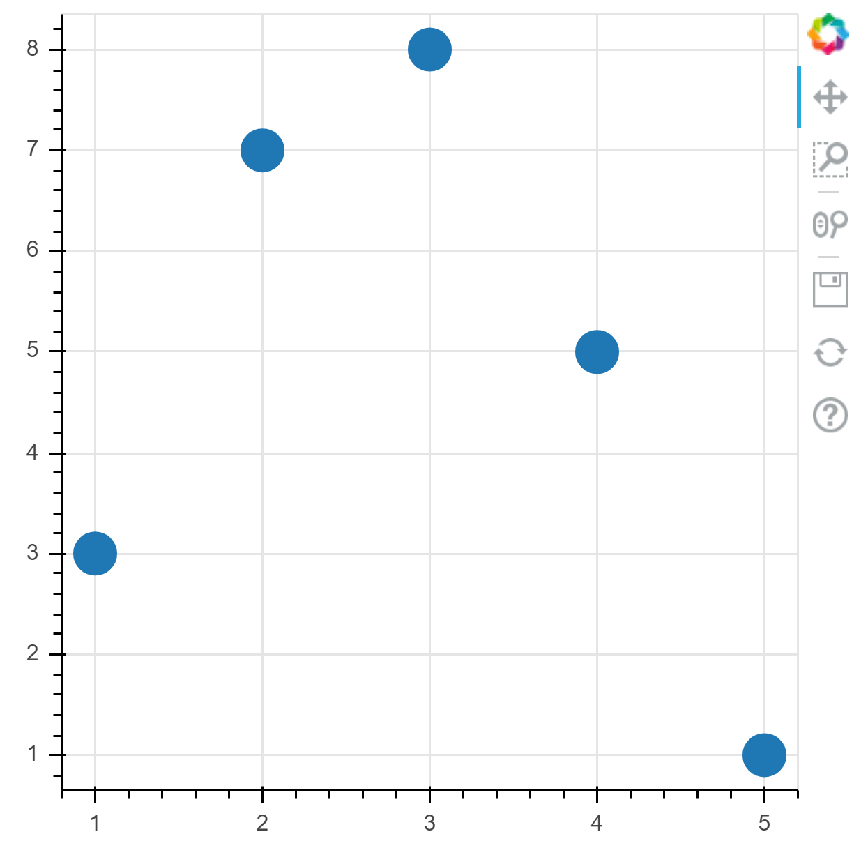
source = ColumnDataSource(data={
    'x' : [1, 2, 3, 4, 5],
    'y' : [3, 7, 8, 5, 1],
})
到现在为止,我们已经通过直接传入文本列表或数据数组来调用诸如 p.circle 之类的函数。
当我们这样做时,Bokeh 会自动为我们创建一个 ColumnDataSource。
但是可以通过将它作为 source 参数传递给 glyph 方法来显式指定一个 ColumnDataSource。
每当我们这样做时,如果想要一个属性(例如 x 或 y 或 fill_color)有一系列值,则需要传递想用于属性的 列名 :
p = figure(
    plot_width=400,
    plot_height=400
)
p.circle(
    'x', 'y', # 列名称
    size=20,
    source=source
)
show(p)
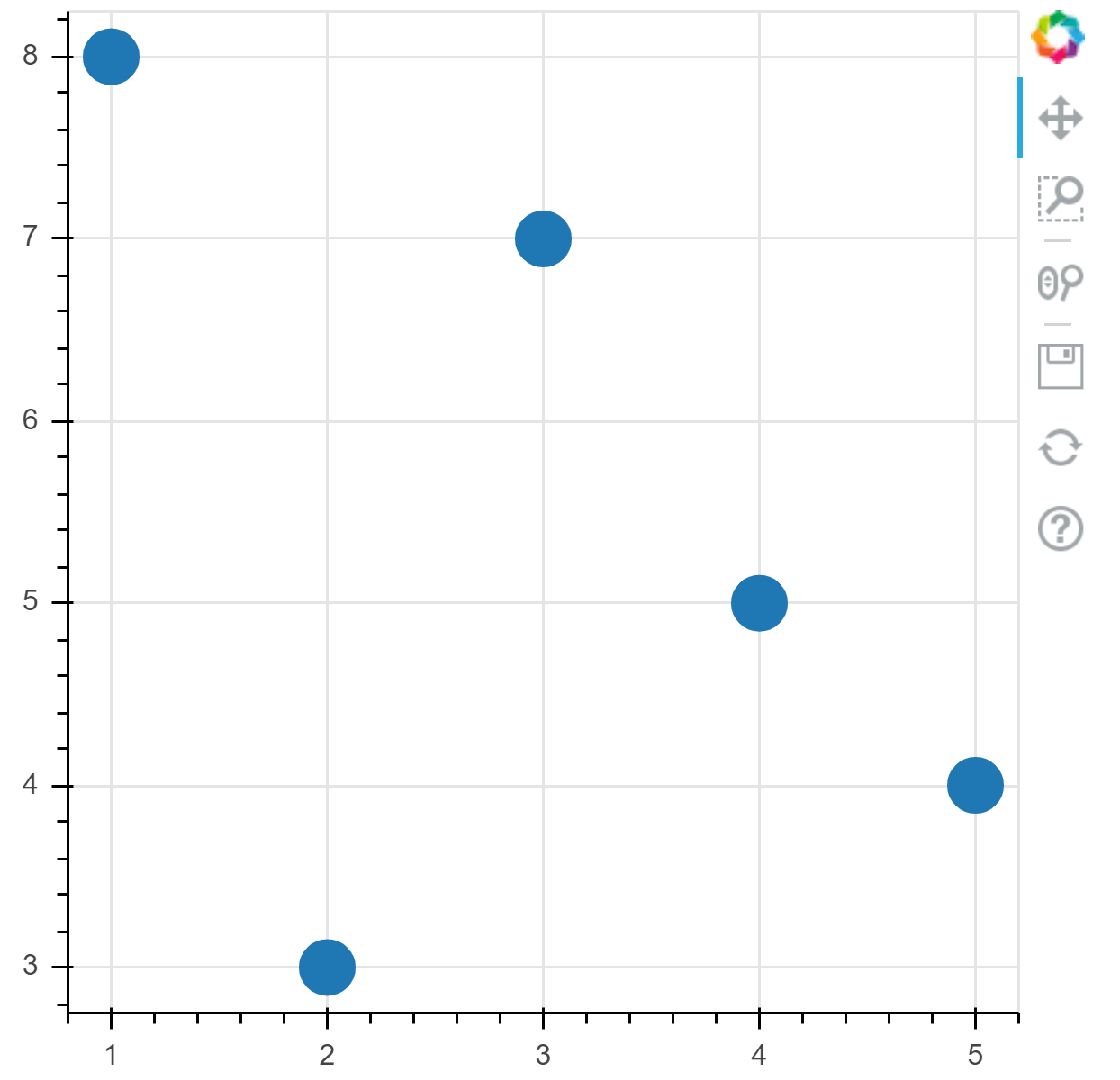
练习:使用 NumPy 数组作为列值创建列数据源并将其绘制
import numpy as np

source = ColumnDataSource(data={
    'x' : np.arange(1, 6),
    'y' : np.array([8, 3, 7, 5, 4]),
})
p = figure(
    plot_width=400,
    plot_height=400
)
p.circle(
    'x', 'y',
    size=20,
    source=source
)
show(p)
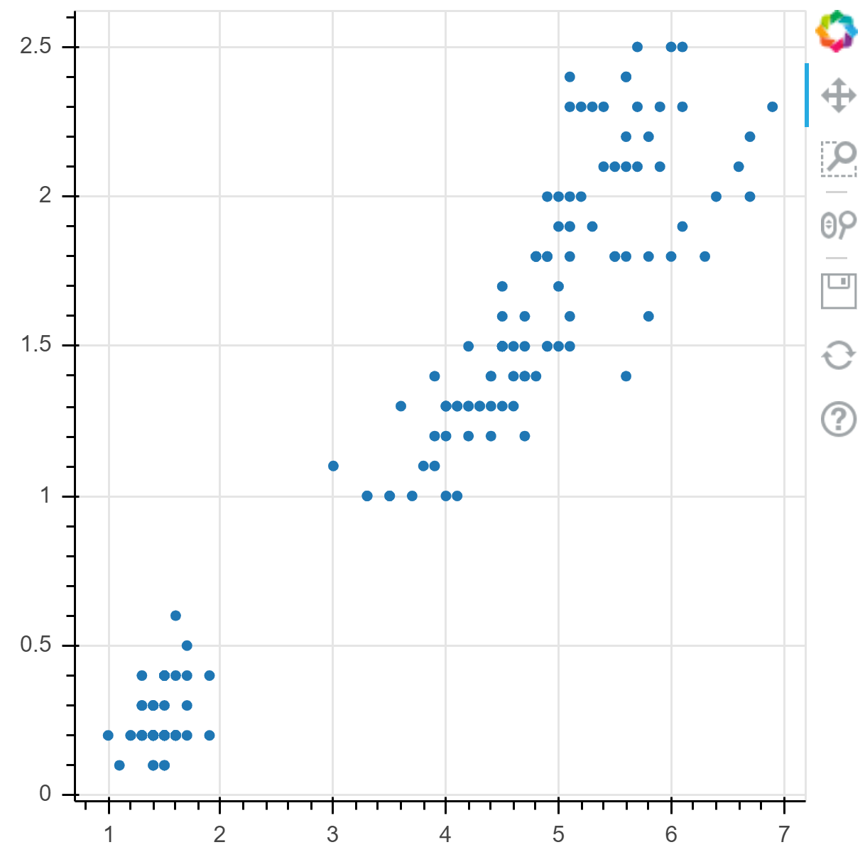
使用 Pandas DataFrames 创建
直接从 Pandas data frames 中创建 ColumnDataSource 对象也很简单。
为此,只需在创建时将 pandas.DataFrame 对象传递给 ColumnDataSource:
from bokeh.sampledata.iris import flowers as df

source = ColumnDataSource(df)
现在,可以像上面一样使用它,方法是将列名传递给 glyph 方法:
p = figure(
    plot_width=400,
    plot_height=400,
)
p.circle(
    'petal_length', 'petal_width',
    source=source,
)
show(p)
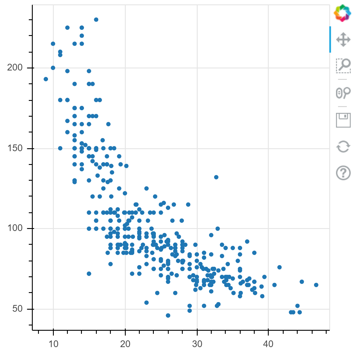
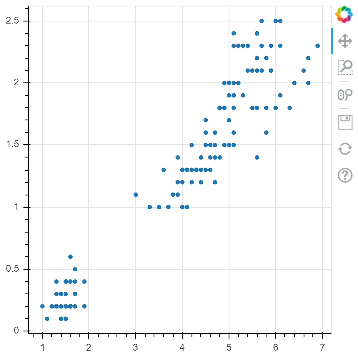
练习: 使用 autompg 样例数据创建一个列数据源并画图
from bokeh.sampledata.autompg import autompg_clean as df

source = ColumnDataSource(df)
p = figure(
    plot_width=400,
    plot_height=400,
)
p.circle(
    'mpg', 'hp',
    source=source,
)
show(p)
自动转换类型
如果不需要共享数据源,则可以方便地将字典,Pandas 的 DataFrame 或 GroupBy 对象直接传递给 glhyph 方法,而无需显式创建 ColumnDataSource。
在这种情况下,将自动创建一个 ColumnDataSource。
from bokeh.sampledata.iris import flowers as df

p = figure(
    plot_width=400,
    plot_height=400
)
p.circle(
    'petal_length', 'petal_width',
    source=df
)
show(p)
转换
除了使用数据源中的列名称配置之外,glyph 属性还可以配置转换对象,用于表示列的转换。
这些用于转换的函数都存在于 bokeh.transform 模块中。
重要的是要注意,当使用这些对象时,转换发生在 浏览器中,而不是在 Python中 。
我们看到的第一个转换是 cumsum 转换,它通过对列中的值进行累加来从数据源列中生成新的值序列。
如下所示,这对于饼图或甜甜圈类型图可能很有用。
from math import pi
import pandas as pd
from bokeh.palettes import Category20c
from bokeh.transform import cumsum

x = {
    'United States': 157,
    'United Kingdom': 93,
    'Japan': 89,
    'China': 63,
    'Germany': 44,
    'India': 42,
    'Italy': 40,
    'Australia': 35,
    'Brazil': 32,
    'France': 31,
    'Taiwan': 31,
    'Spain': 29,
}

data = pd.Series(x) \
    .reset_index(name='value') \
    .rename(columns={'index':'country'})
data['color'] = Category20c[len(x)]

# 将每个值表示为一个角度 angle = value / total * 2pi
data['angle'] = data['value']/data['value'].sum() * 2*pi

p = figure(
    plot_height=350,
    title="Pie Chart",
    toolbar_location=None,
    tools="hover",
    tooltips="@country: @value"
)

p.wedge(
    x=0,
    y=1,
    radius=0.4,

    # 使用 cumsum 计算数值的累加和,表示起始和结束角度
    start_angle=cumsum('angle', include_zero=True),
    end_angle=cumsum('angle'),

    line_color="white",
    fill_color='color',
    legend_field='country',
    source=data)

p.axis.axis_label=None
p.axis.visible=False
p.grid.grid_line_color = None

show(p)
我们看的下一个变换是 linear_cmap 变换,它可以通过将线性颜色映射应用于数据源列来生成新的颜色序列。
from bokeh.transform import linear_cmap

N = 4000
data = dict(
    x=np.random.random(size=N) * 100,
    y=np.random.random(size=N) * 100,
    r=np.random.random(size=N) * 1.5,
)

p = figure()

p.circle(
    'x', 'y',
    radius='r',
    source=data,
    fill_alpha=0.6,

    # 基于 x 坐标轴的色表
    color=linear_cmap('x', 'Viridis256', 0, 100)
)

show(p)
将上面的代码更改为使用 log_cmap 并观察结果。
尝试更改 low 和 high,并具体说明 low_color 和 high_color。
from bokeh.transform import log_cmap
p = figure()

p.circle(
    'x', 'y',
    radius='r',
    source=data,
    fill_alpha=0.6,

    # 基于 x 坐标轴的色表
    color=log_cmap(
        'x', 'Viridis256',
        low=10,
        high=90,
        low_color="blue",
        high_color="red"
    )
)

show(p)
练习: 使用相应的 factor_cmap 对 iris 数据集的散点图进行颜色映射
from bokeh.sampledata.iris import flowers
from bokeh.transform import factor_cmap
from bokeh.palettes import Viridis3

p = figure()

p.circle(
    'sepal_length', 'sepal_width',
    size=10,
    source=flowers,
    fill_alpha=0.6,

    color=factor_cmap(
        'species',
        palette=Viridis3,
        factors=['setosa', 'versicolor', 'virginica'],
    )
)

show(p)